In lane Electric Vehicles
Citroën Karin vs. Tesla Cybertruck: What Makes a Radical Design Work
Description
The Karin’s curves, cabin position and shifting surfaces give its wedge shape more depth than the Cybertruck’s hard-edged design.
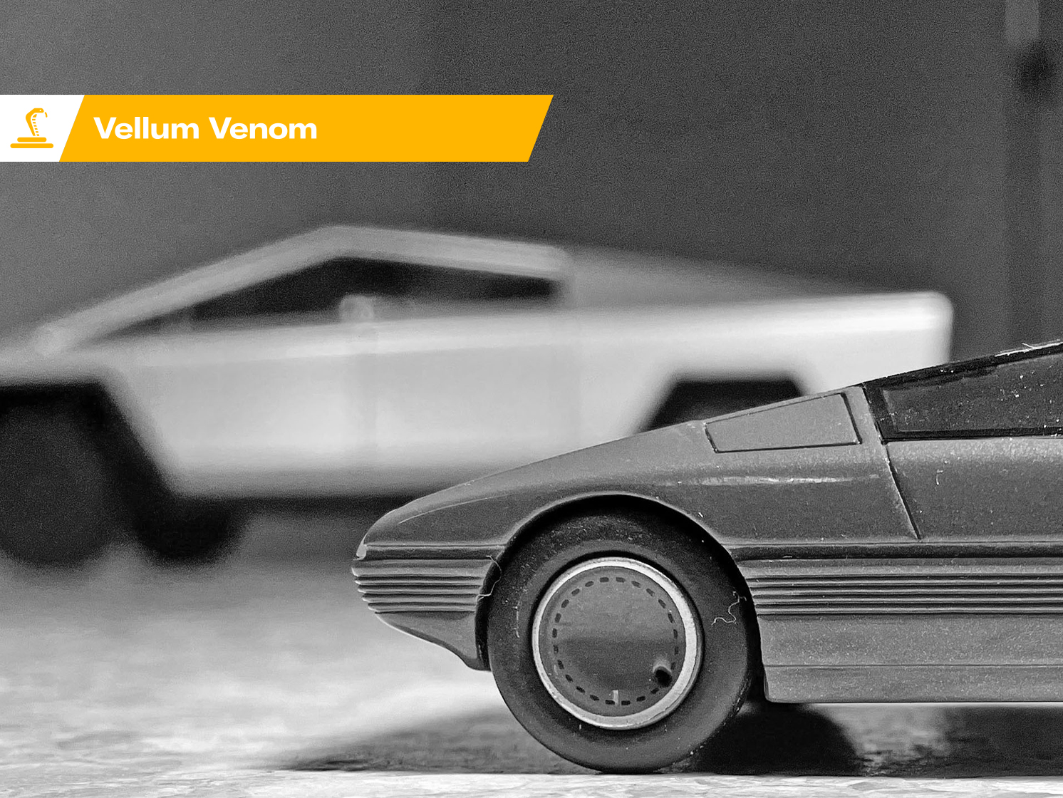
The 1980 Citroën Karin and the 2024 Tesla Cybertruck share a taste for bold geometry, but they show how much more goes into a successful radical design than a striking outline. The Karin’s curves, tapering glass and unusual proportions make its wedge feel layered from different angles. The Cybertruck’s hard folds deliver a clearer, harsher statement, one that can depend heavily on viewpoint.
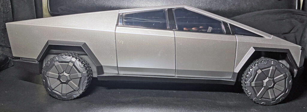
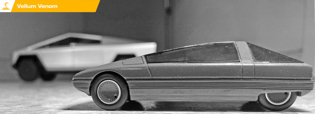
The comparison drew more than 100,000 likes, shares and comments on social media, prompting a closer look at the design relationship. Both vehicles project a futuristic vision shaped by the era that produced them. Since the full-size cars weren’t available to compare side by side, this examination used an official 1:18-scale replica of the Cybertruck concept and a 1:43-scale Citroën Karin model by Franstyle. The focus here is the Karin, with the Cybertruck as a foil.
Light reveals the Karin’s shaping
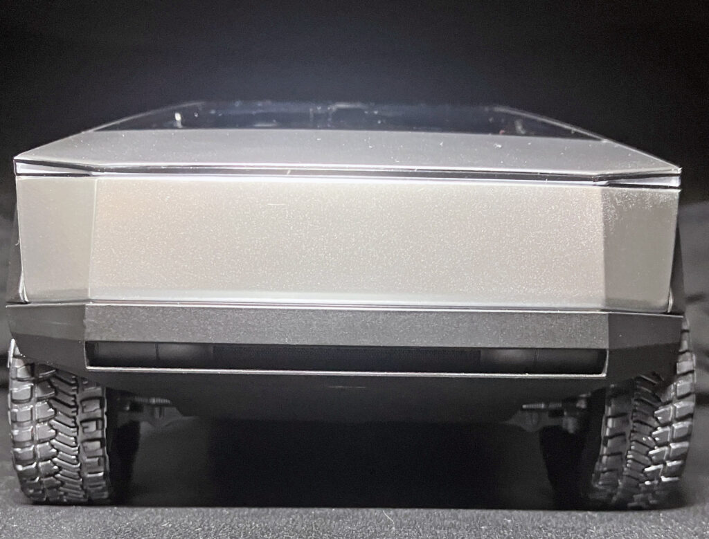
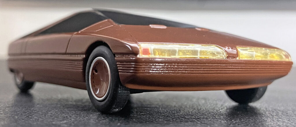
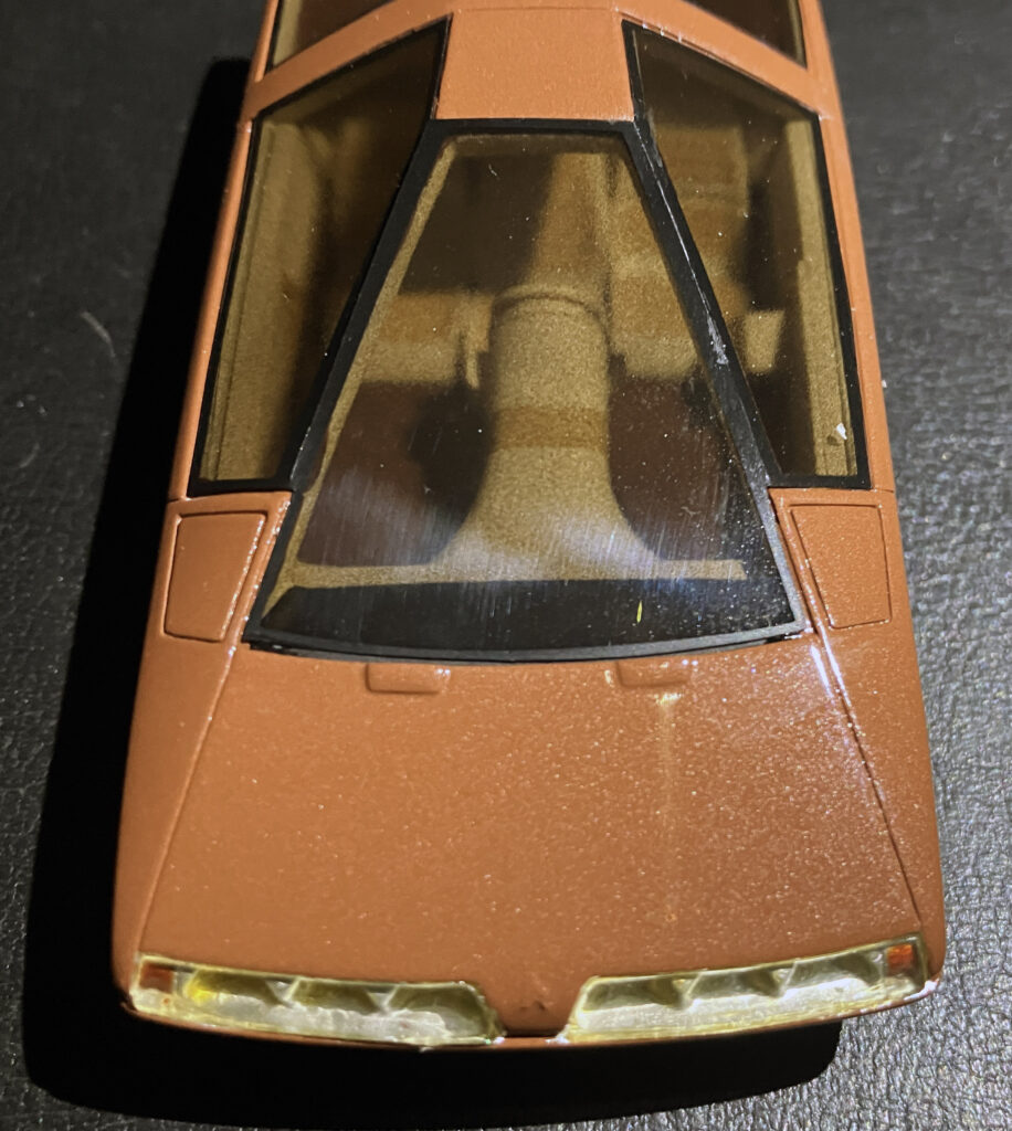
Run a light across a car’s body and its surfacing becomes easier to read. What looks like a flat front on the Karin develops a slight smile as the light moves across it. A row of ribs appears below the headlights, and the lower valance reveals surprising depth. Its air dam sits well behind the headlight area, giving the nose layered shadows instead of one uninterrupted plane.
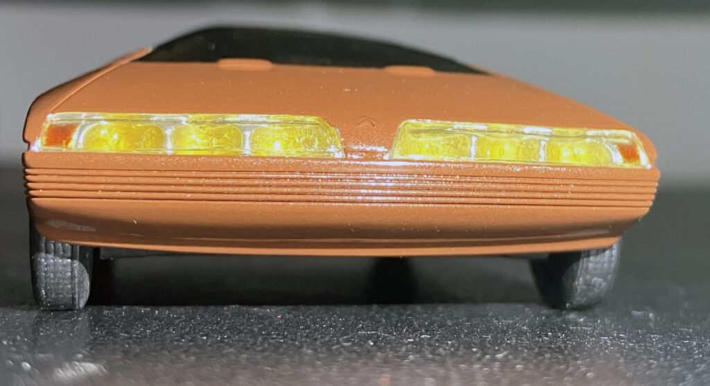
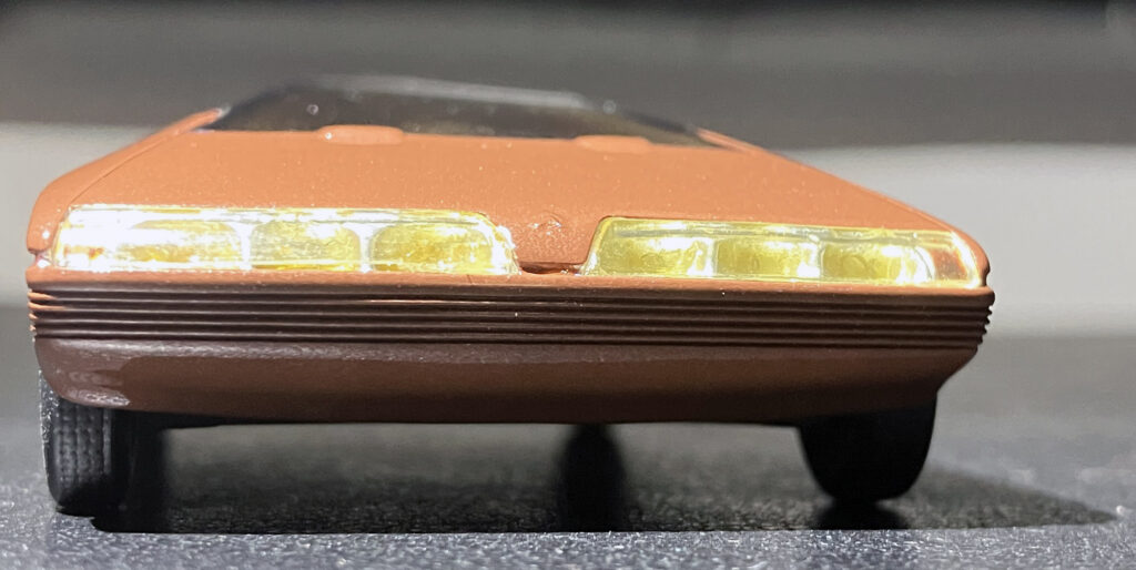
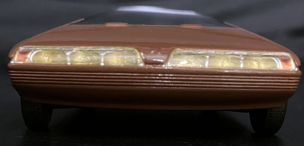
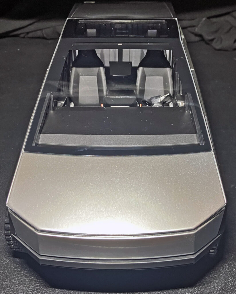
The Cybertruck also has visible shaping, but it gets there through sharp creases in the stainless-steel front and dark bumper. The Karin’s subtler contours give its wedge more texture. That distinction matters: a design can be simple without appearing blank, provided its surfaces bend and catch light with intent.
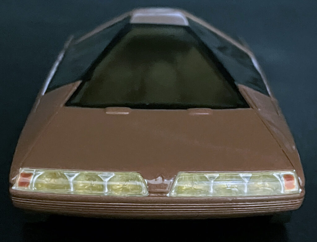
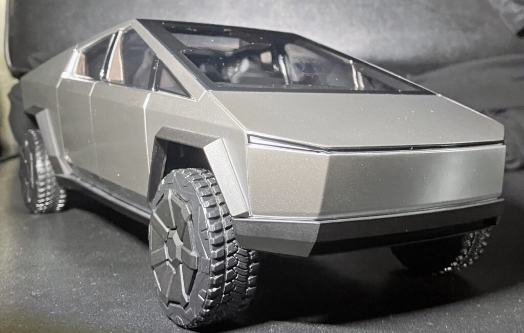
The difference carries into the front three-quarter view. The Karin’s rounded fenders soften its straight bumper details, which bend around the body. The Cybertruck’s steel panels keep their origami-like edges. Neither approach is automatically right, but the Karin shows how a few soft transitions can make an extreme shape feel more considered. Too many curves can make a car look bulbous; too few can leave its surfaces feeling unforgiving.
Tapered glass and proportion do the heavy lifting
A key to the Karin’s character is tumblehome: the greenhouse tapers inward toward its roof. From the front, that slope lets the glass belong to the same broad pyramid theme as the body. The Cybertruck has a fixed window ahead of its front door to accommodate its steep windshield angle, while the Karin’s compact body and center-mounted driver allow the bodywork to fill the corresponding space.
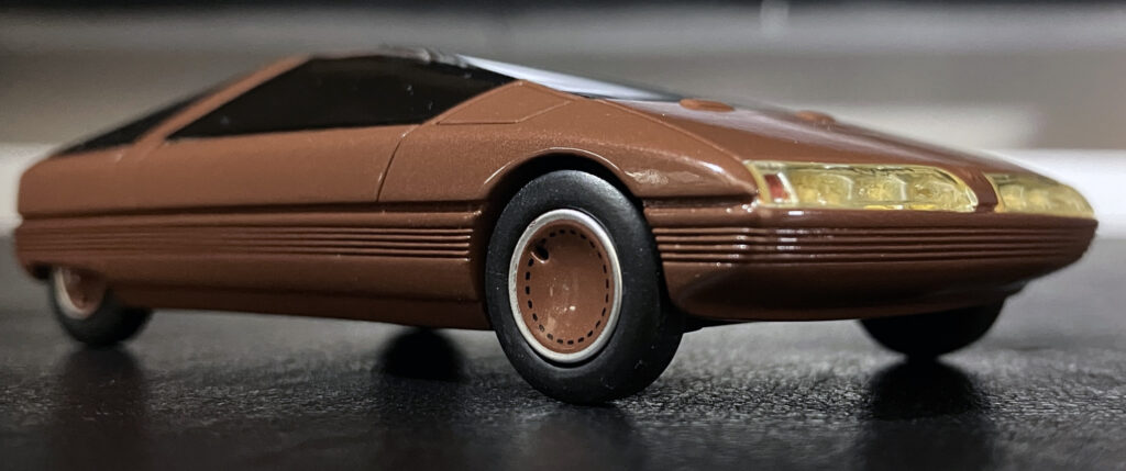
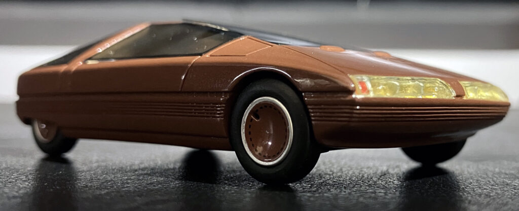
Lighting makes the Karin’s taper easy to spot even in a flat image. A distinct bend below the glass separates the illuminated upper body from the shadowed lower portion, then runs down toward the front bumper. It gives the design a visual break and helps the roof, glass and nose read as connected parts rather than a single slab.
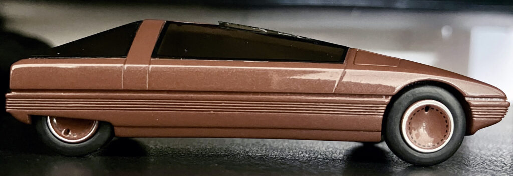
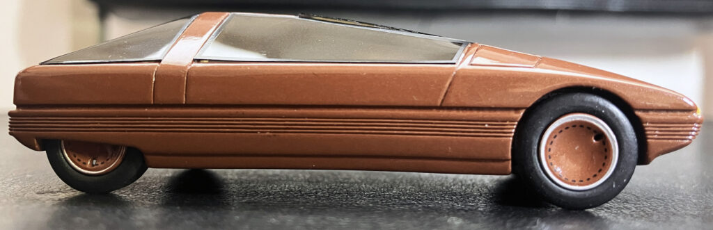
Side proportions reinforce the difference. The Karin puts its cabin well behind the front axle, creating a long-hood, short-deck profile and a generous dash-to-axle distance. It recalls proportions associated with sports cars, despite the Karin’s conception as a small people mover. The Cybertruck places its cabin farther forward, producing a more cab-forward stance and a broad dashboard that evokes a minivan. The contrast illustrates a familiar design tension: cabin space is practical, yet pushing the passenger compartment forward can change the whole character of a vehicle’s profile.

Rear views expose the trade-offs
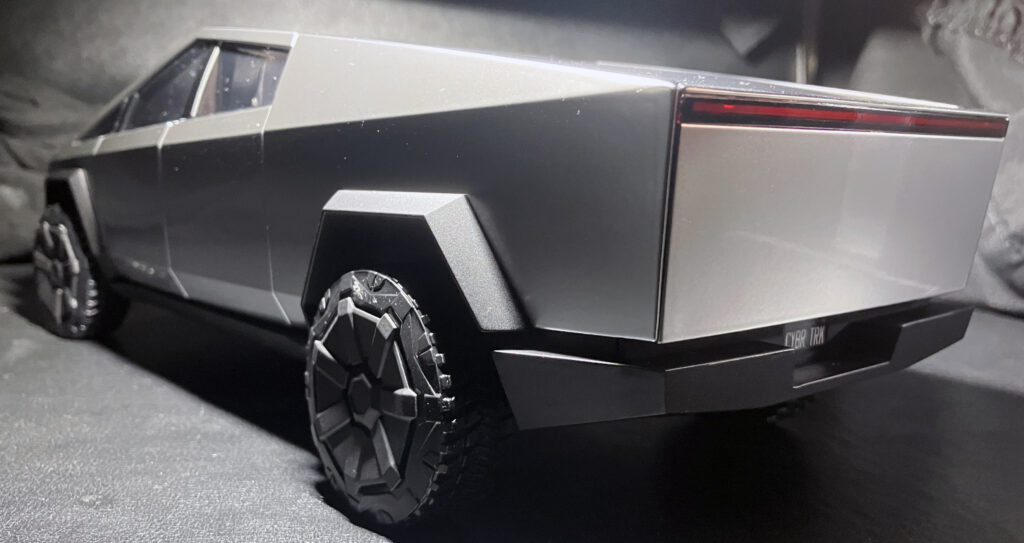
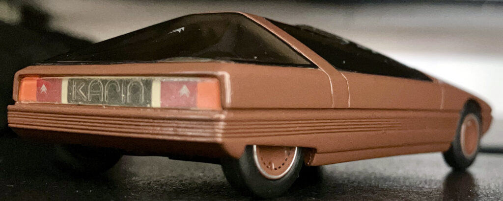
The Karin’s rear three-quarter view is just as bold as its nose, but its upright rear face, tapering glass and rounded bumper keep the shape from looking quite as severe. The roofline has an unusual mix of an AMC Pacer-like cabin section and a wedge-shaped outline. At the rear, the body can look almost organic beside the Cybertruck, whose strong line below the side glass runs from front to back and dominates the view.
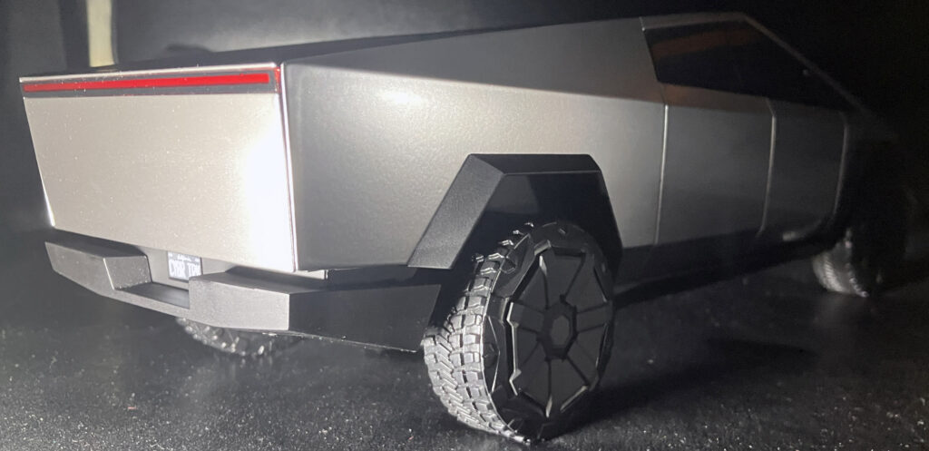
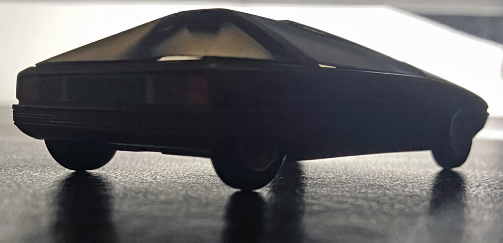
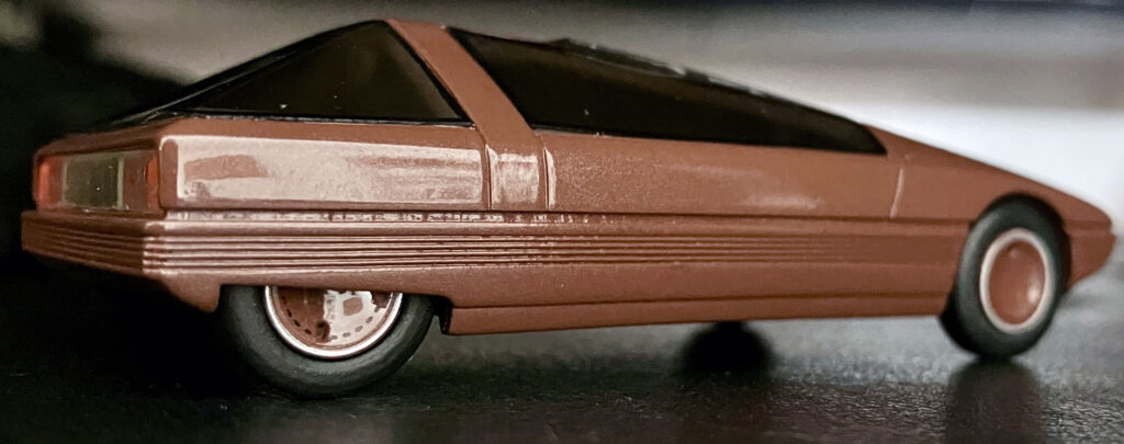
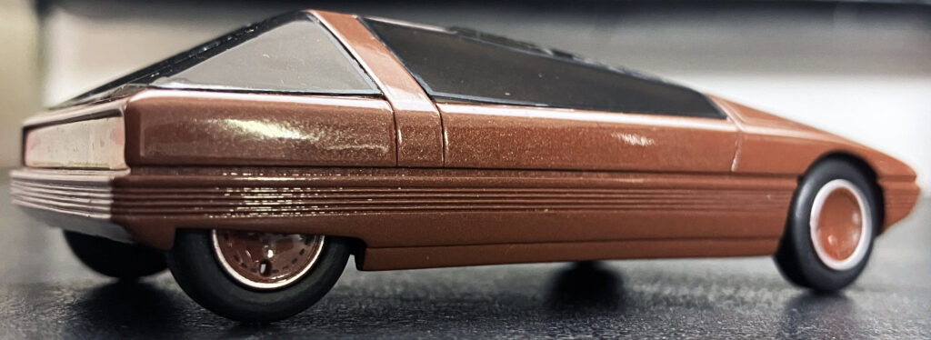
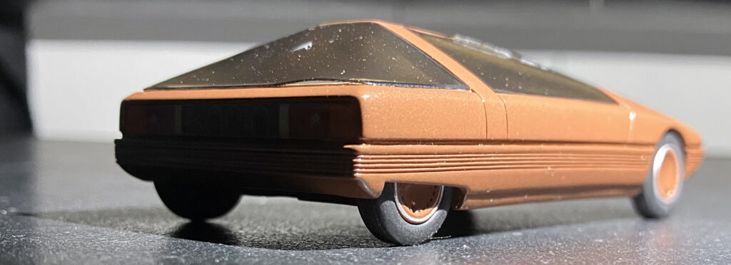
That line gives the Cybertruck a forceful profile, though the abrupt light-to-shadow change can make it visually heavy. The Karin reduces that weight with glass that tapers inward, a softer transition below the windows and a body that narrows toward the rocker panels. The Cybertruck uses dark trim near the rockers to create some separation, but the Karin’s body shaping does more of the work before trim enters the picture.
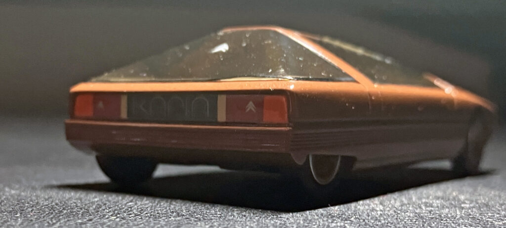

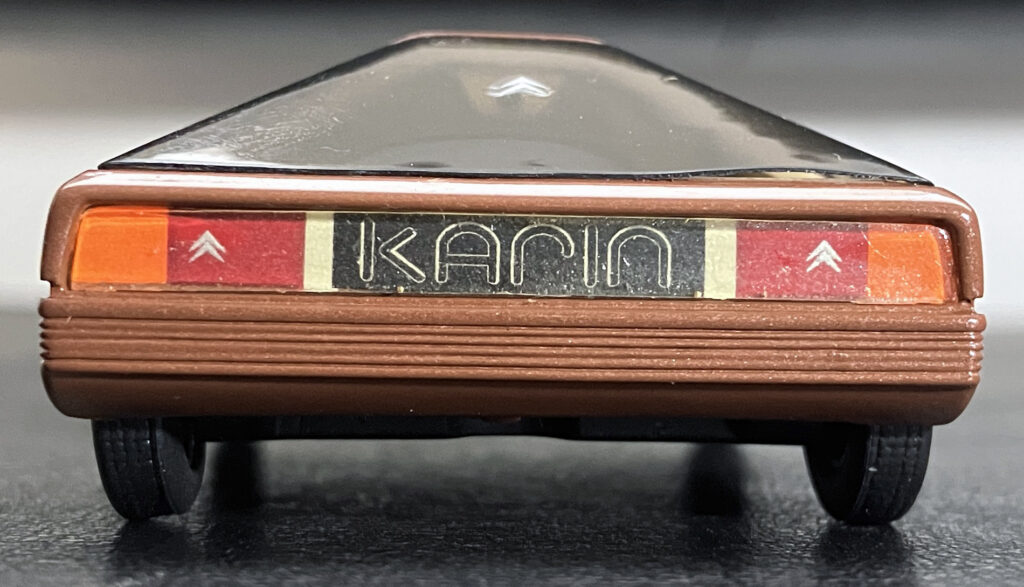
Both designs make a forceful impression from behind, where the shape seems to take priority over conventional utility. For the Karin, the sculpted bumper brings texture and depth to the lower body, drawing inward toward the rear axle. The Cybertruck has a minimalist tailgate and raised bed rails. Its pickup layout limits how far the lower body can tuck inward because the rear still has to work as a truck. The comparison points to a practical constraint: a radical hatchback-like form has more freedom at the rear than a pickup, whose bed and bumper have to meet familiar functional expectations.


One wedge, many vanishing points
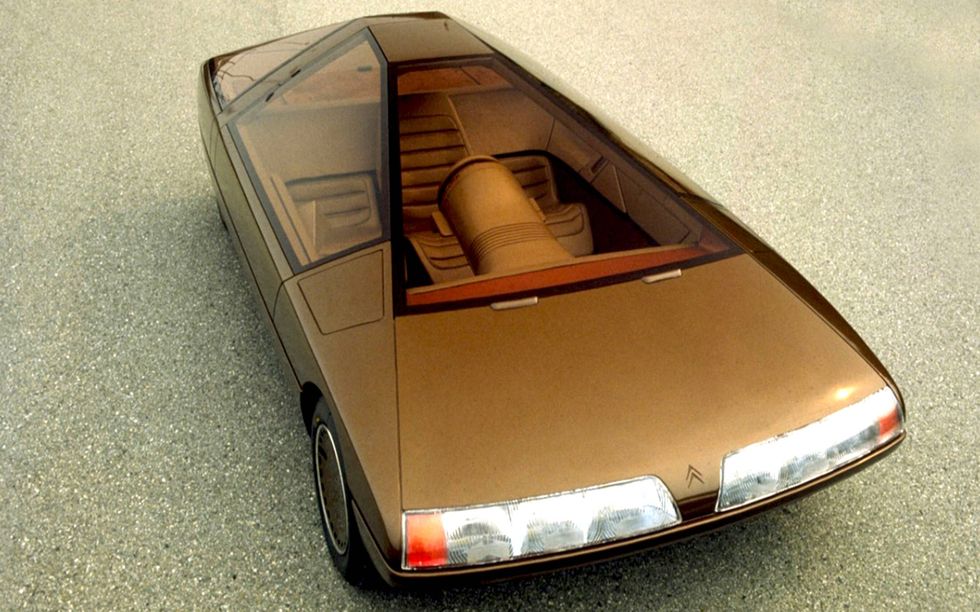
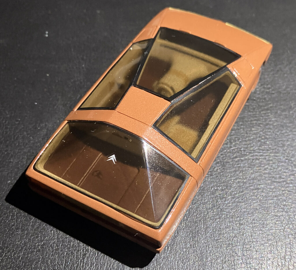
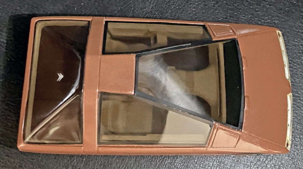
The Karin’s glass is more than a window treatment. With light above the roof, its broad surfaces become a prominent part of the design and bring the Citroën badge into view. A different light source draws attention to the unusual B-pillar and the camera mounted between the pillars. Its central driving position helps explain the dramatic inward taper: the driver sits where the roof offers the most headroom, while the outer seats may be more constrained.
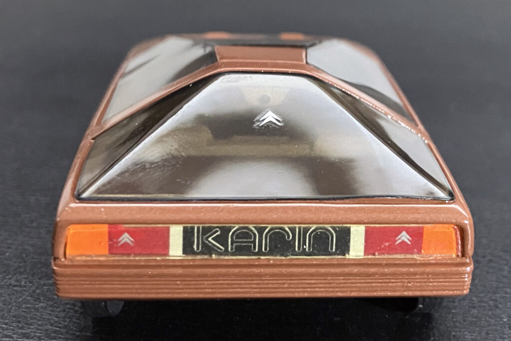
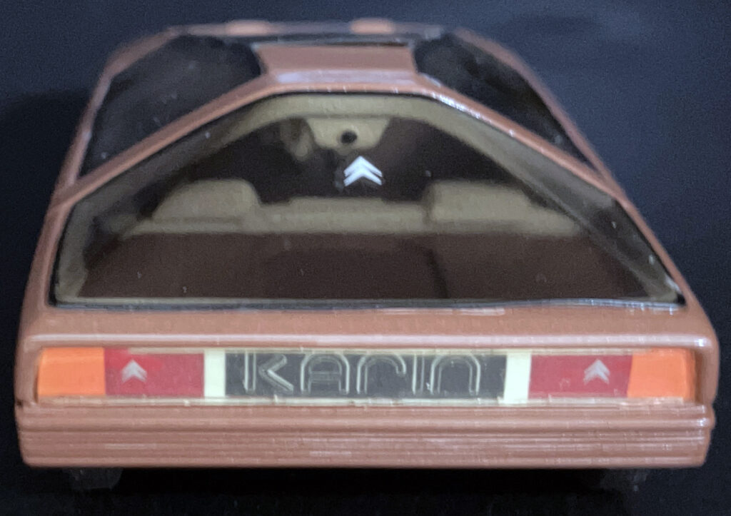
The roof and body also use several different vanishing points. The windshield follows one direction, the roof another, and the rear-window lines introduce a further angle. That variety helps the Karin avoid the simple-pyramid reading its silhouette might suggest. The windshield pillars sweep backward, while the more upright rear glass balances them. The result feels deliberately asymmetrical, and more interesting for it.
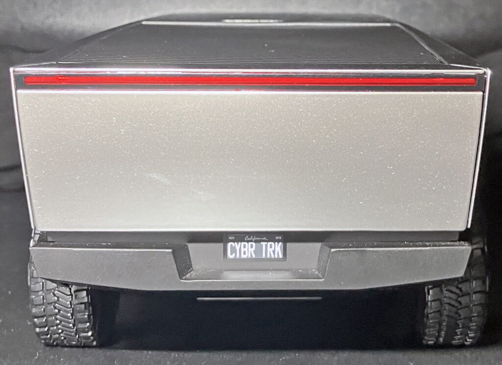
By comparison, the Cybertruck aligns more of its visual lines: the hood flows toward the windshield, and the bed relates to the roof. With fewer changes of direction, the roof takes on a peak-like profile. Its side glass does taper inward, but the pillars’ shape softens the effect. A stronger taper might sharpen the concept’s look, though the source article points out that a production vehicle has packaging and structural demands that shape the pillars.
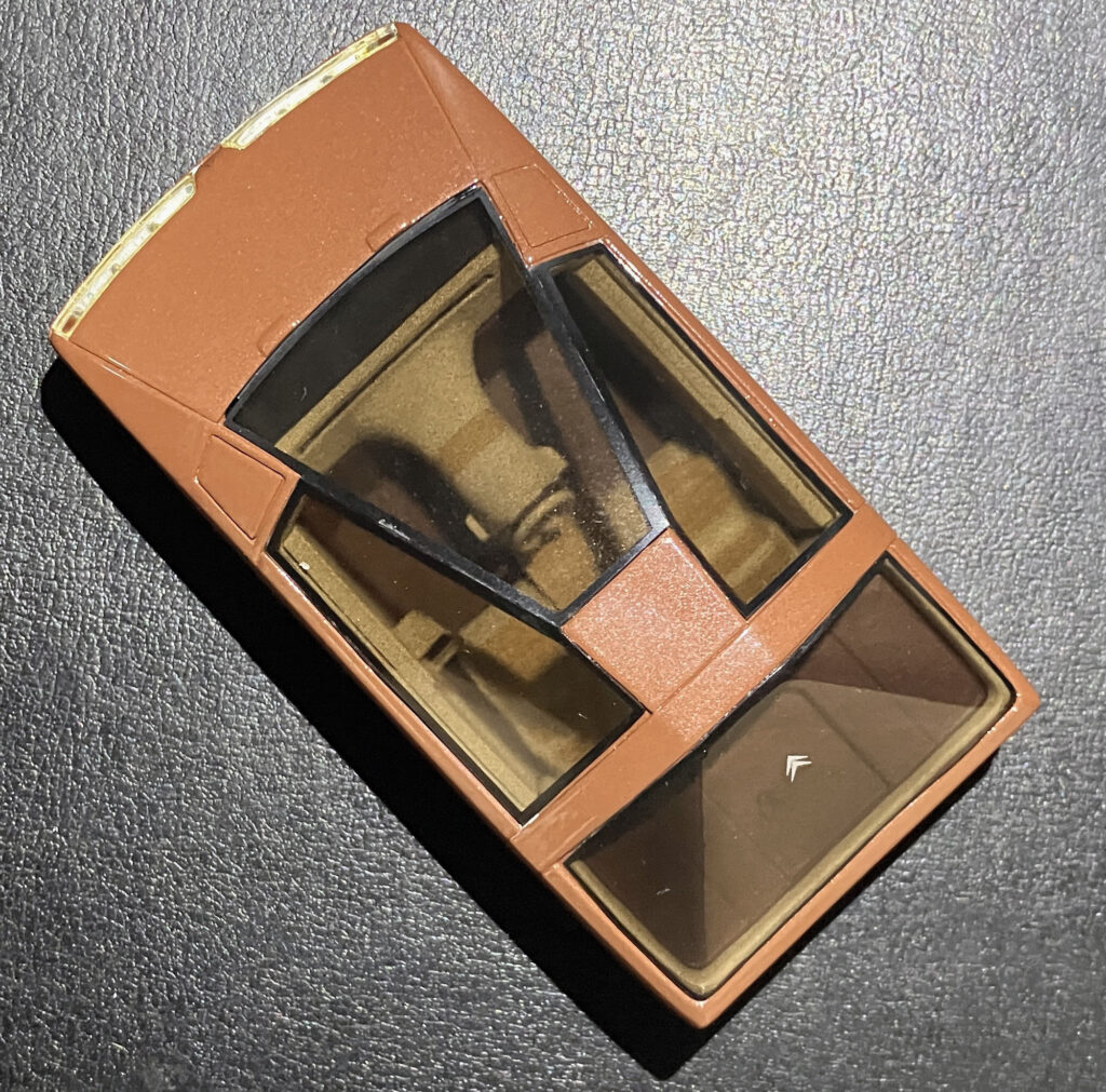
Position matters, too. The Karin’s driver sits well back from the front axle, which lies beneath the hood. The Cybertruck’s cab-forward layout puts the driving position nearer the axle and reinforces its van-like proportions. The Karin’s stance has more in common with a sports car, despite its people-moving brief. These are different solutions to packaging, but the more rearward cabin gives the Citroën a long dash-to-axle relationship that supports its unusual wedge.
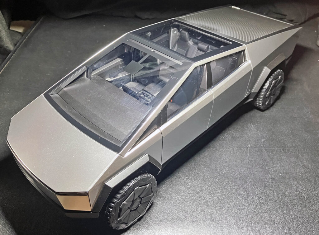
The model’s larger size exceeded the homemade light box, preventing a true overhead photograph.
The Karin’s front and rear surfaces add another layer. Its fender tops sit on an intermediate plane between the nose and the sides, and its round headlight assemblies are deeply recessed and scalloped. Those details complicate the silhouette without obscuring it. The Cybertruck has no equivalent plane between windshield and fender, though the nose does curve gently. The original article also cites a drag coefficient of 0.38 or 0.34, depending on the source; the uncertainty is a reminder that the comparison here is about visible design, not a definitive technical assessment.
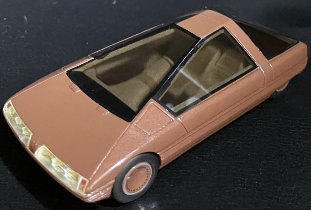
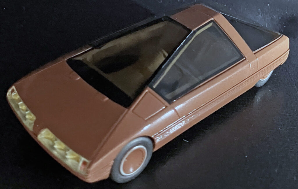
The Cybertruck’s front uses a pair of planes to connect the nose with its fenders, creating a modest beak-like curve. That’s a softer note within an otherwise angular body, but it doesn’t change the overall impression as much as the Karin’s multiple surfaces and curved transitions.
The comparison comes down to four strengths in the Karin’s design: tapered greenhouse glass, a cabin set back from the front axle, more varied line directions across the body, and soft contours placed among the sharper edges. Together, those features make its radical shape feel more resolved. They also help explain why simply calling the Karin a pyramid misses the work of Citroën design boss Trevor Fiore.
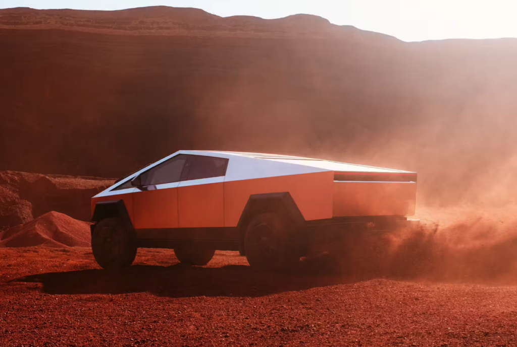
The Cybertruck concept shown here changed before production, particularly around the headlights, which sit between the front fascia and bumper on the production model. The concept’s central design idea nevertheless carried through. The Karin, by contrast, remained a 1980 concept. It’s easy to picture its compact, three-seat layout as an intriguing urban commuter, although the model comparison offers no basis for claims about how it would have worked in daily use.
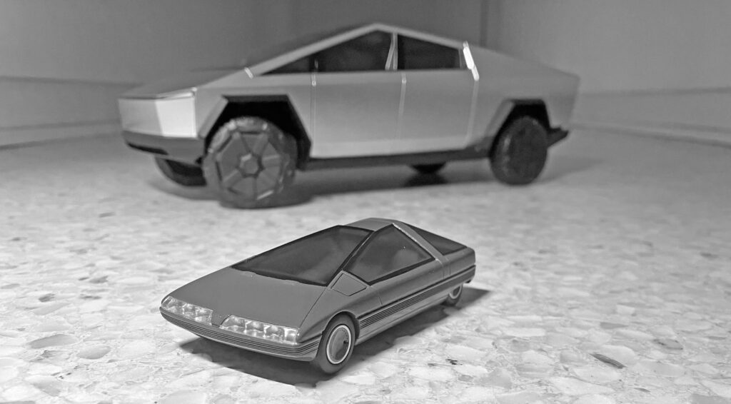
The Cybertruck proves that a hard-edged wedge can become a production vehicle; the Karin shows how much nuance can sit inside a similarly radical outline. Its proportions, glass and surfacing give the design more to reveal as the light and viewpoint change. That’s the useful lesson in this pairing: bold geometry draws attention, while carefully managed surfaces give it staying power.