In lane Electric Vehicles
1983 Aston Martin Lagonda: William Towns’ Wedge-Shaped Luxury Saloon
Description
The Lagonda pairs a low, Countach-like profile with luxury-car proportions, intricate surfacing and a usable trunk—a bold design that still stands apart.
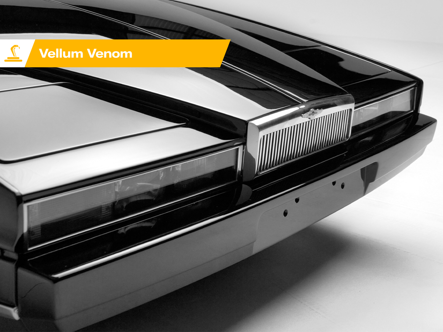
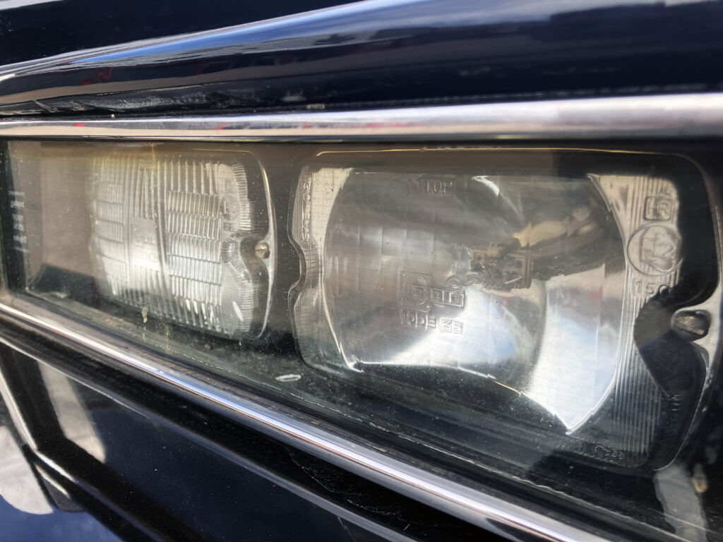
The 1983 Aston Martin Lagonda makes a case for a kind of luxury that doesn’t need a tall grille, a rounded body or acres of chrome. Its low roof, long bonnet and sharply drawn surfaces bring the Lamborghini Countach to mind, yet this is a four-door saloon with an ergonomic cabin and a usable boot. William Towns and his team gave Aston Martin a striking answer to the stately Rolls-Royce: a flagship that looked as if it had arrived from a different decade.
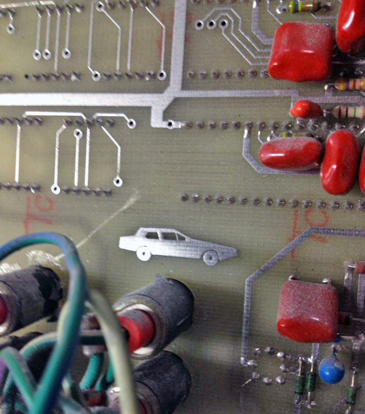
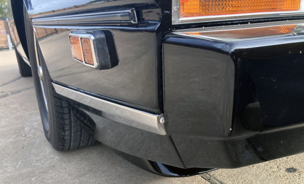
The writer watched this particular car being restored. A detail that stayed with him was the Lagonda’s distinctive body shape etched into the gauge-cluster circuit board: a small sign of how thoroughly the car’s design reached beyond its sheet metal.
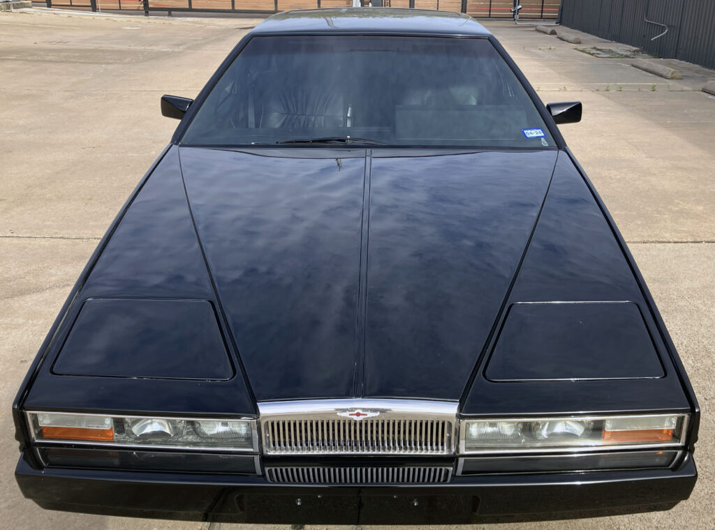
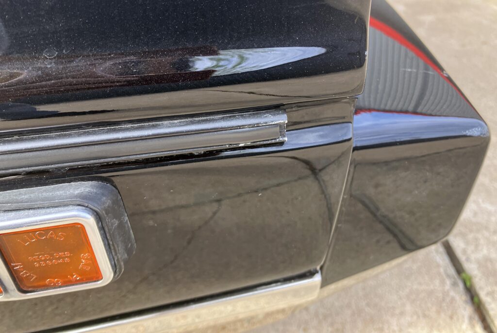
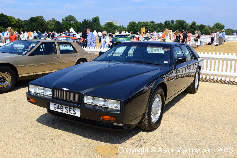
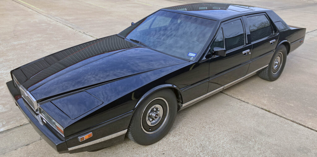
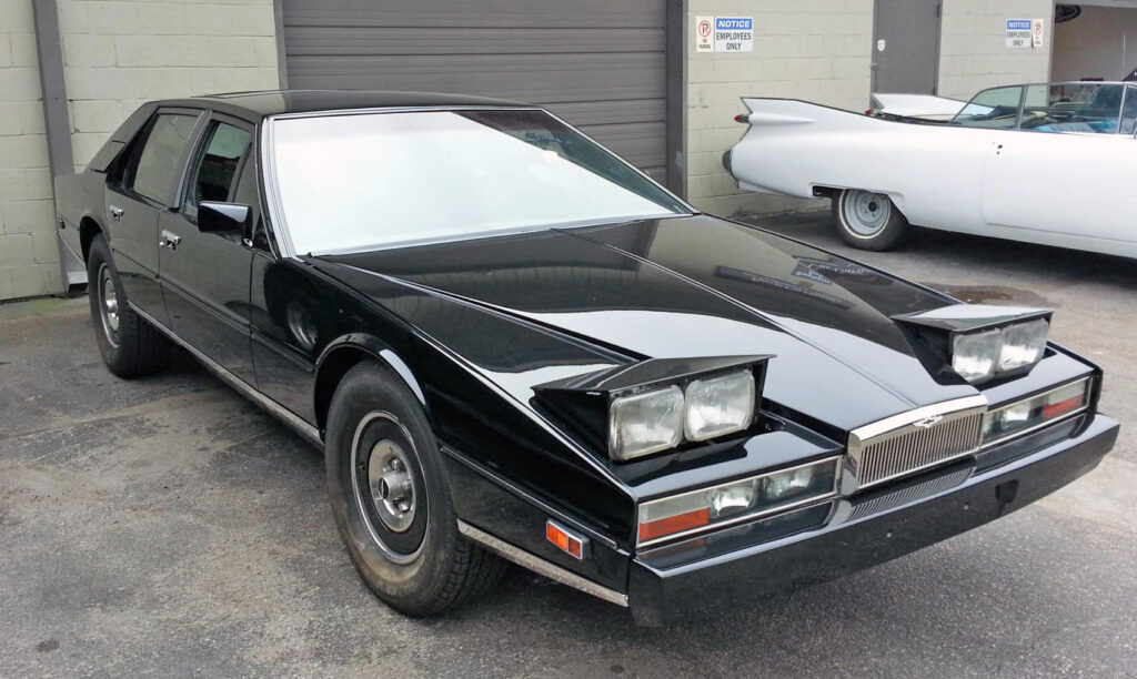
From the front, the traditional grille and bright trim give the car a recognizable luxury-car face. Then the proportions complicate the picture. The bonnet stretches forward and falls toward the road, while the cabin sits low behind it. The result is a sedan that can look like a supercar from one angle and a formal British flagship from another. Its outline is built mostly from straight edges, but a closer look shows plenty of subtle shaping beneath the apparent simplicity.
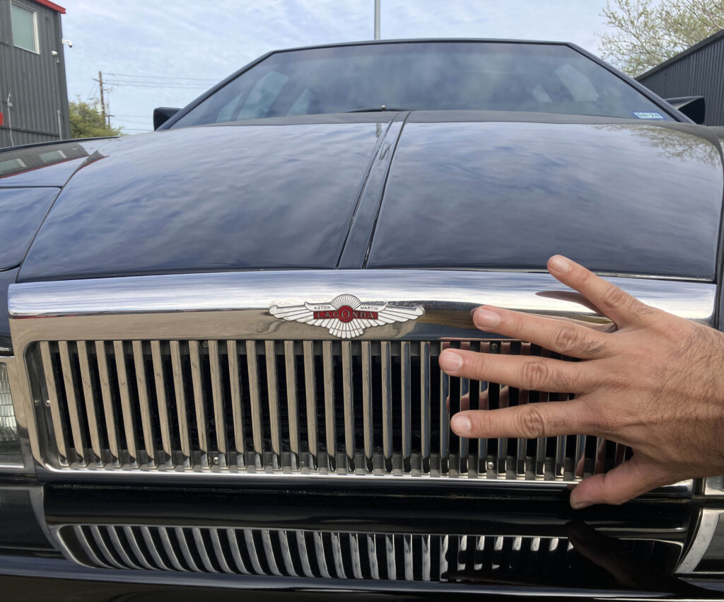
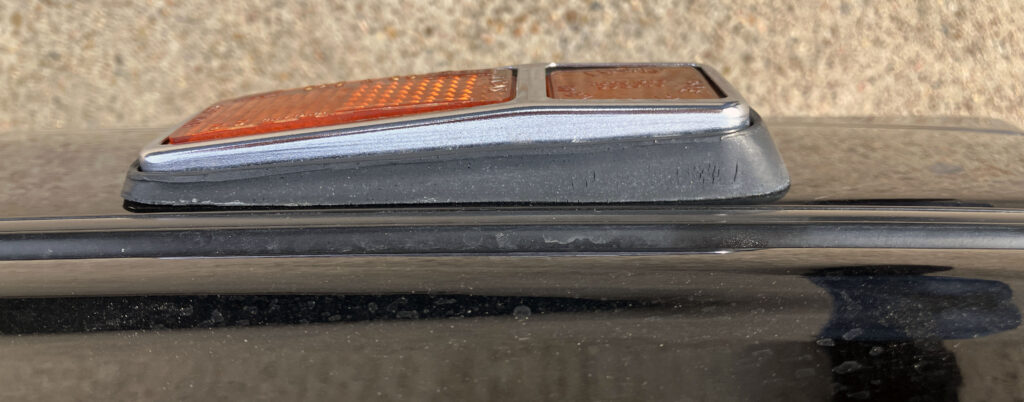
The grille sits unusually close to the ground. The writer had to kneel to photograph it, an indignity he associates with a Countach. That low nose was part of the point: the Lagonda was meant to challenge the upright, imposing look of a Rolls-Royce while still presenting as a serious luxury car.
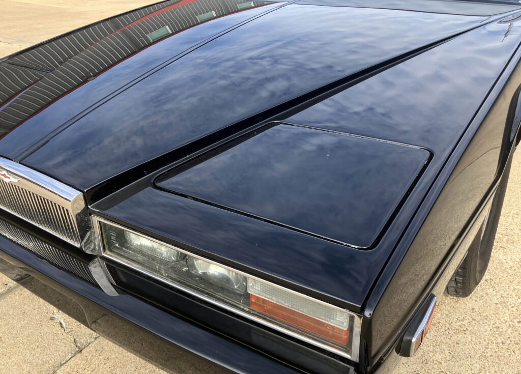
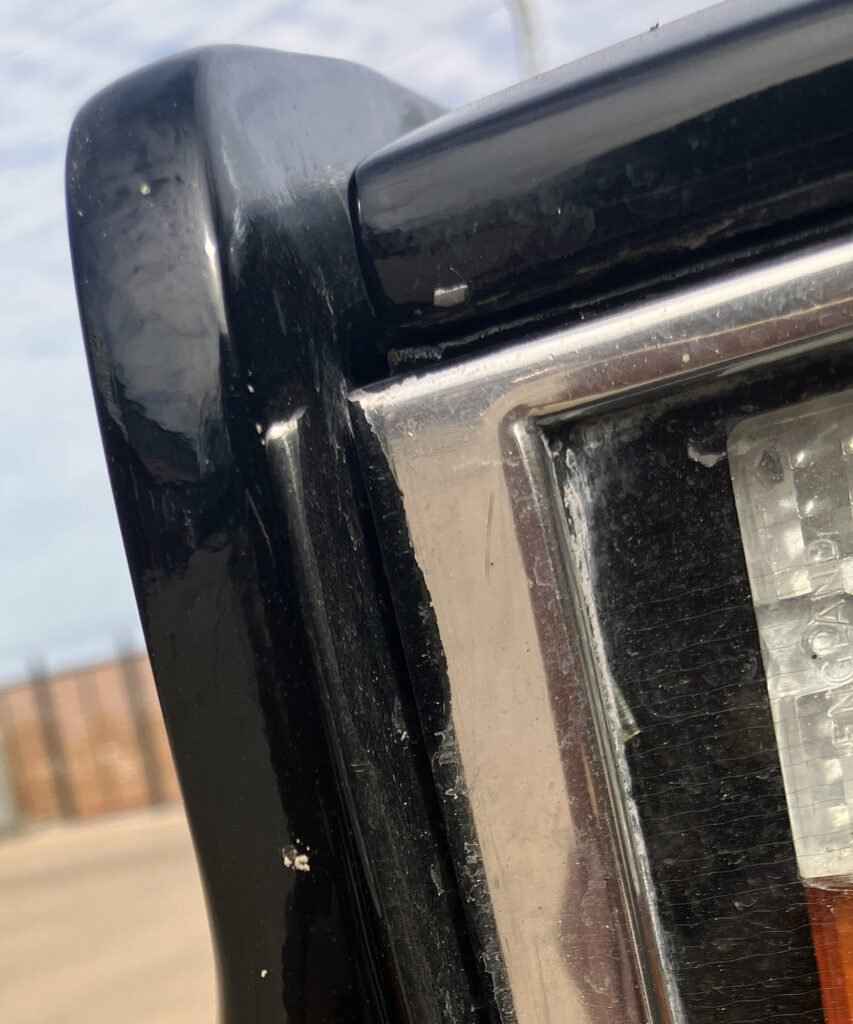
Towns is often associated with the folded-paper approach to car design. The Lagonda’s upright front, flat-sided fenders and sculpted power bulge certainly support the description. But “folded paper” can make the body sound flatter than it is. The bonnet’s taper and the rounded wheel arches show Towns using curves to give those crisp lines depth.
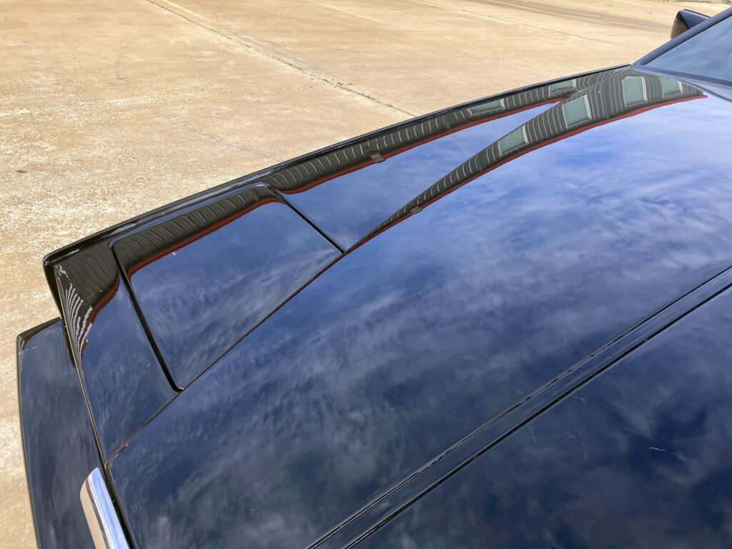
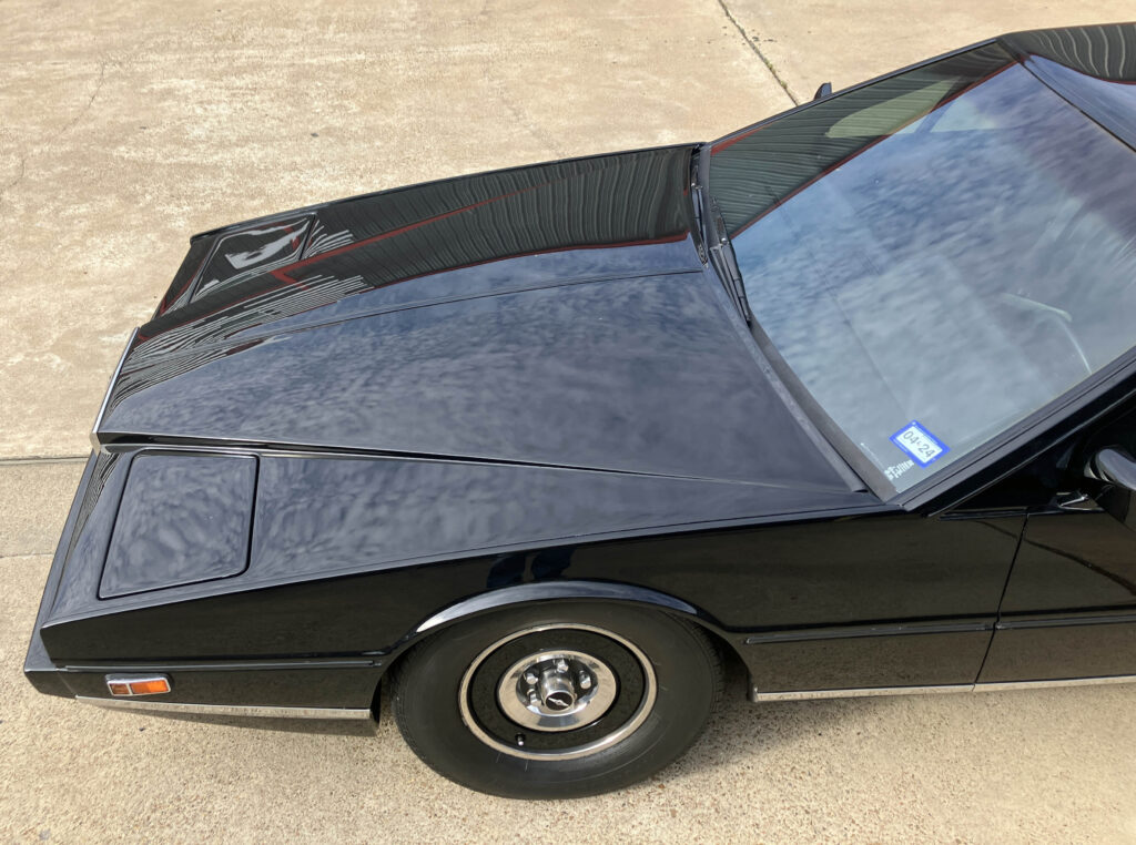
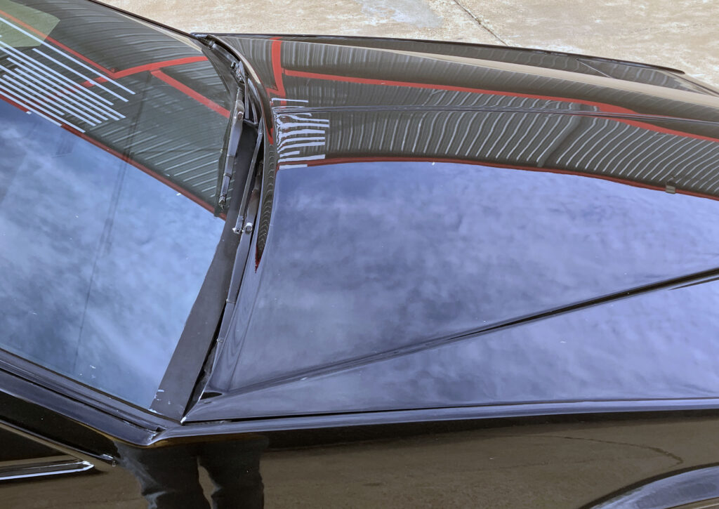
Look along the bonnet and the reflections bend and change width on their way to the nose. The shape’s most memorable impression is angular, yet this surface work gives it more nuance than a simple wedge. The distinction matters: Towns had to make a dramatic form read as a finished, expensive car from a range of viewpoints.
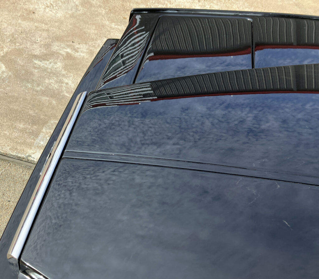
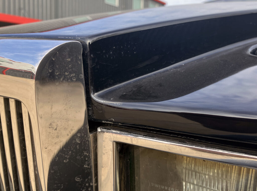
The meeting of grille, bonnet and front fascia makes the design’s geometry especially clear. There’s less rounded surfacing here than on a contemporary Lincoln Town Car. Towns’ work belongs to the minimalist design language that took hold in Britain in the 1970s, with a severity that recalls the Brutalist lines of London’s Barbican Centre.
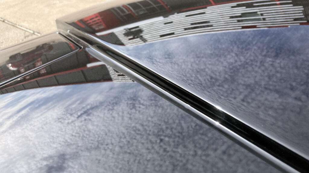
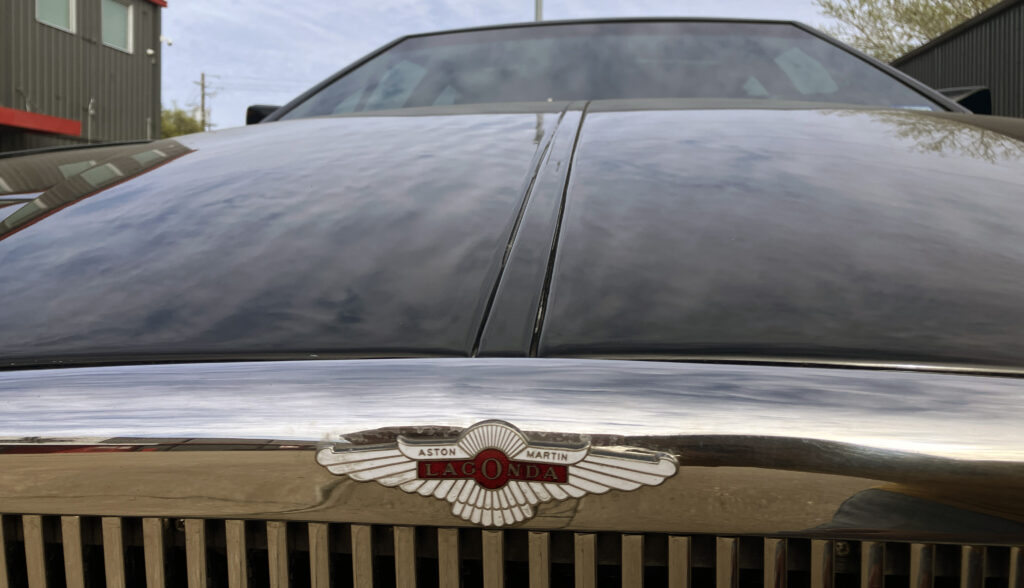
A central bonnet crease has long been part of British car styling. Here, Towns turns it into a pair of recessed channels that frame the raised centre section. Seen from above, the change looks forceful without adding ornament. The visual message is direct: this is a powerful car, even when the body is doing most of the talking.
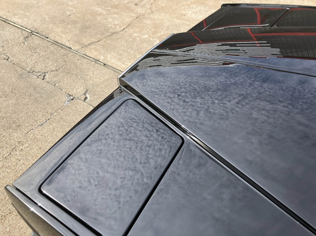
The chrome-edged lighting arrangement includes fog lamps, driving lamps, amber turn signals and elevated city lights. The low and high beams are hidden behind covers, preserving the narrow face that defines the car. A pair of details show the limits as well as the ambition of the design: the city lights look awkward from close range, and the lighting units don’t sit as cleanly into the body as a modern flush-mounted assembly might.
That packaging reflects the period in which the car was conceived. Aston Martin was a small company with limited resources, and discreet attachment points and custom-shaped lighting covers were difficult to achieve. A later Series IV car used six headlights, but the earlier pop-up arrangement better protects the low, slim nose. With the main lamps stowed, the front remains visually narrow; exposed conventional lamps would add height and bulk.
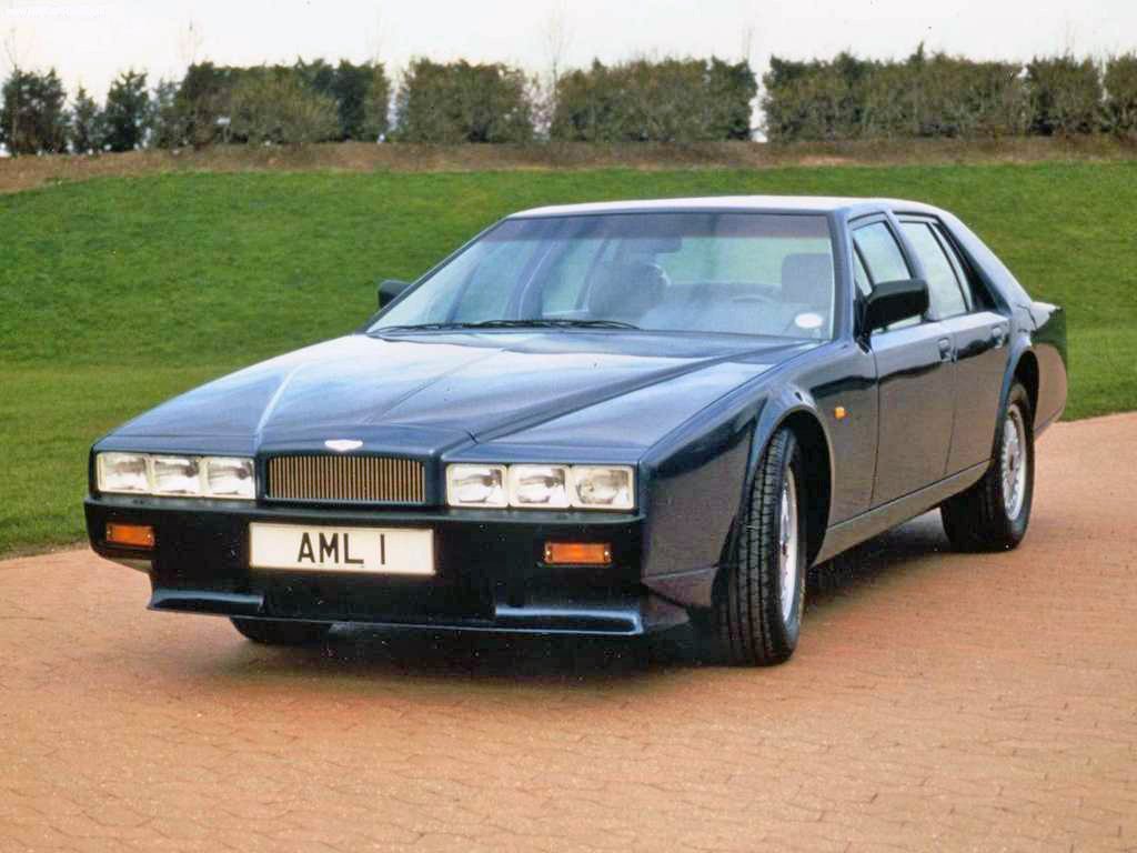
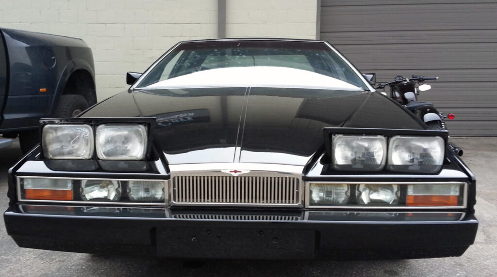
The bumpers are a less convincing compromise. Their large sections were shaped to meet the requirements of the American market, with a recessed lower portion that helps cut visual weight. From a distance, the arrangement looks restrained. Up close, the front bumper doesn’t fully merge with the body, a familiar challenge for cars of this era. Its lower valance may also help manage airflow, though the source describes that benefit as a likelihood rather than a measured result.
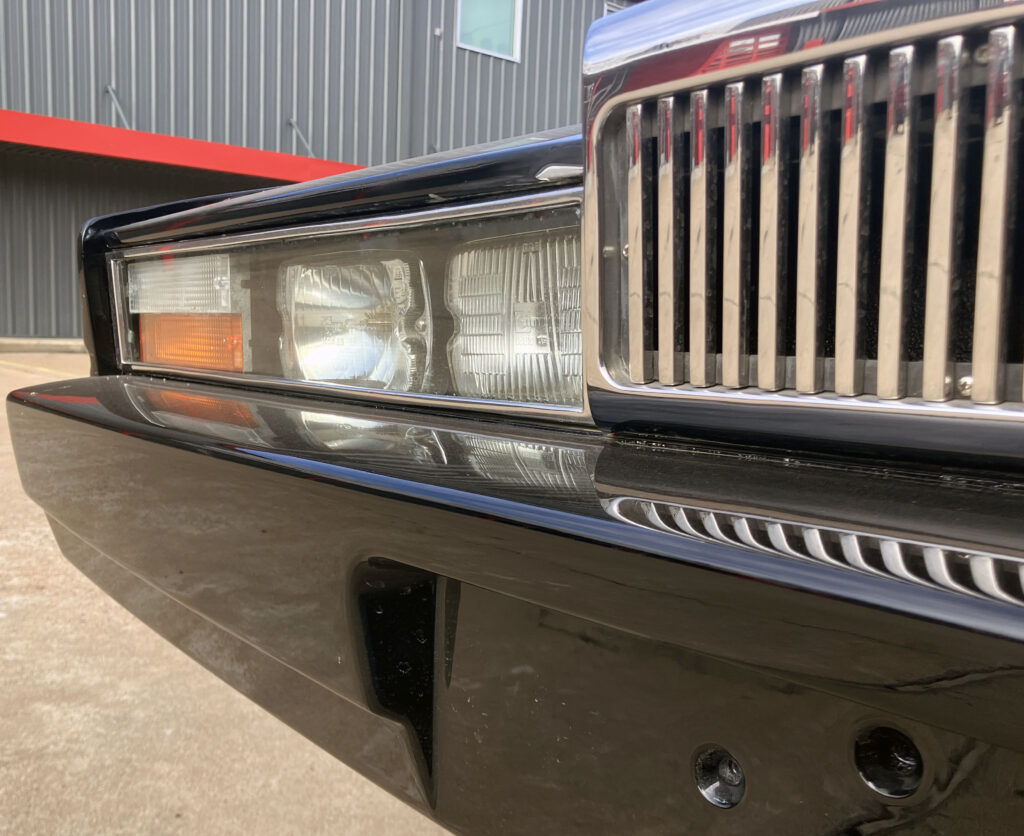
The front overhang is substantial, but the low fascia and layered lower edge make it part of the car’s stance. The bumper relief creates an area of shadow underneath, which keeps the nose from appearing as heavy as its dimensions suggest. It’s a clever visual device on a car whose main challenge is balancing a long front end against an unusually low body.
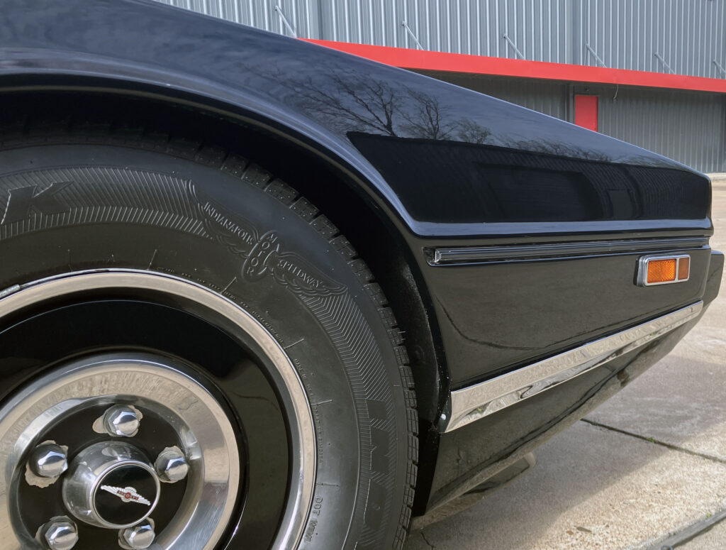
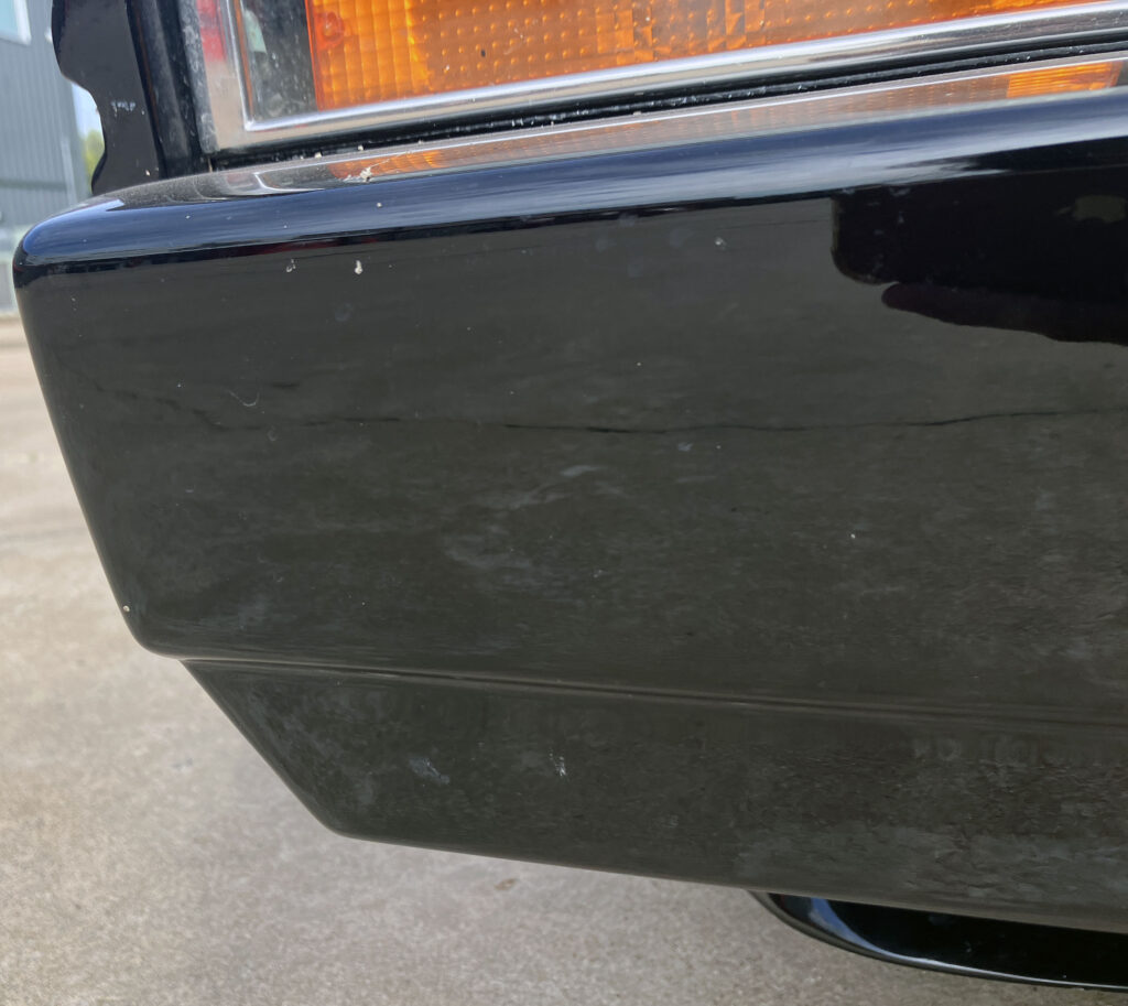
Some smaller details are harder to defend. The side moulding ends quickly, and the marker lights protrude from the body in a way that feels older than the rest of the design. Aston Martin had already sourced the 727 TorqueFlite gearbox from Chrysler, so borrowing a more discreet side-marker treatment from another parts bin would have been an understandable choice. Instead, these lamps interrupt the clean flank.
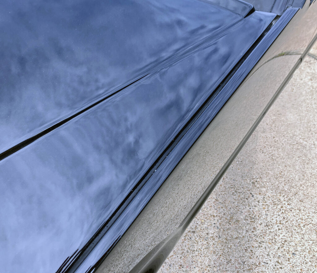
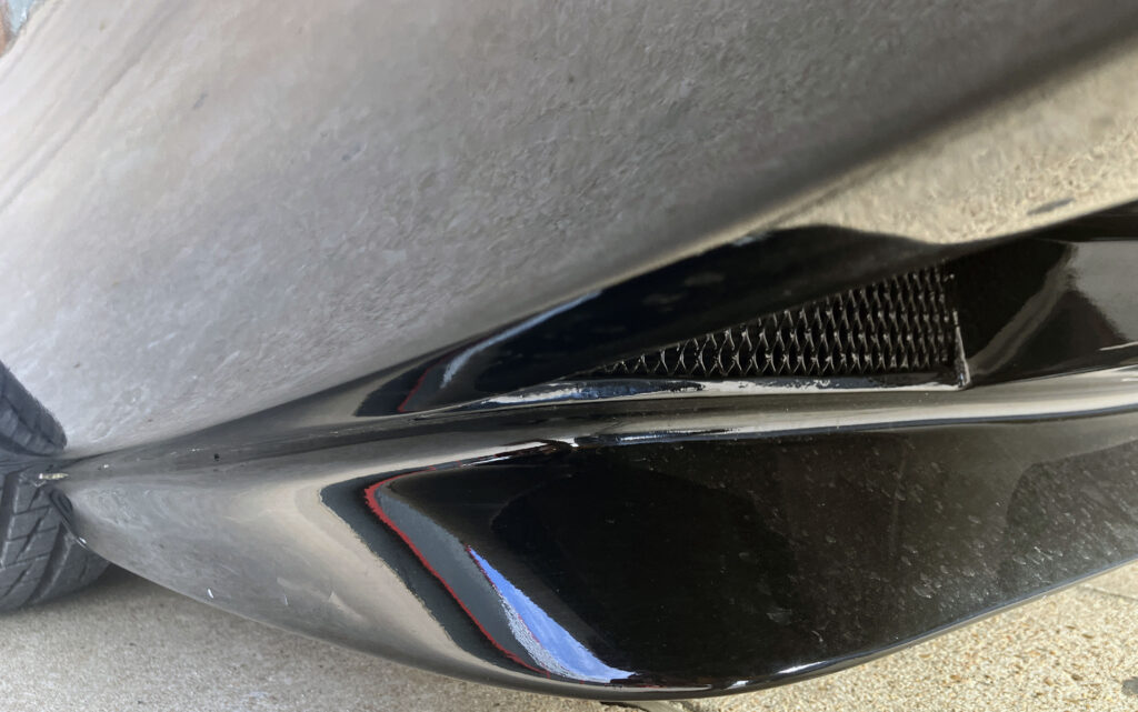
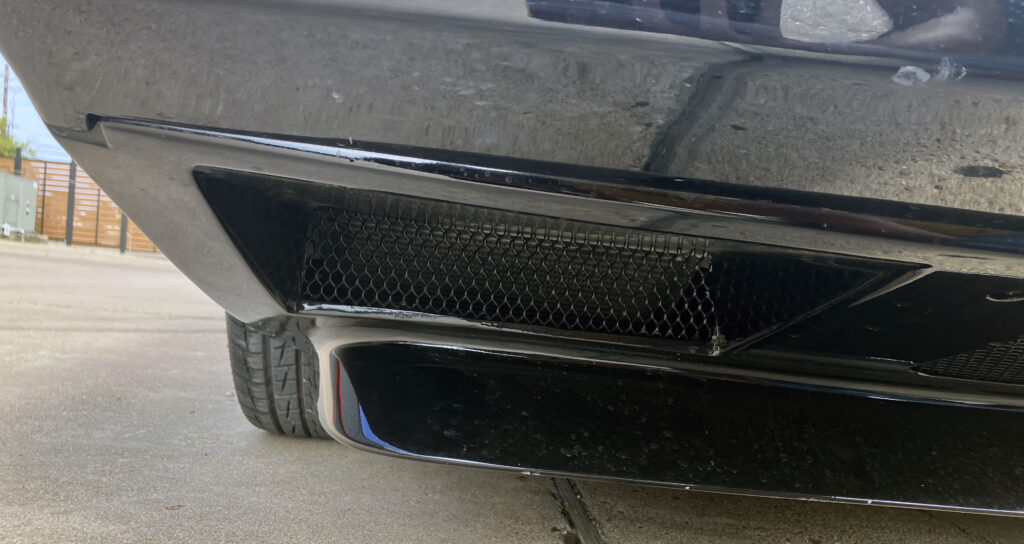
The fenders make up for those interruptions. At the front, sharp blade-like extensions project ahead of the fascia, and a firm crease around the lighting gives the nose a precise outline. The hard edges are softened by carefully shaped surfaces, a combination that makes the car look designed rather than merely cut from flat panels. That distinction becomes clearer as the viewing angle rises: the bonnet’s contours change the front end’s expression.
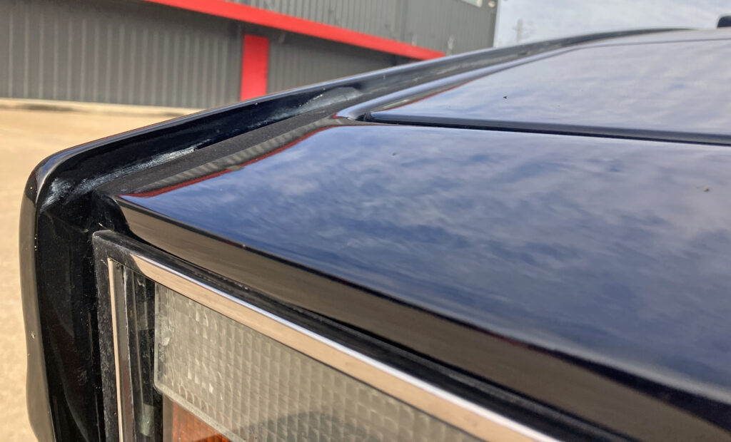
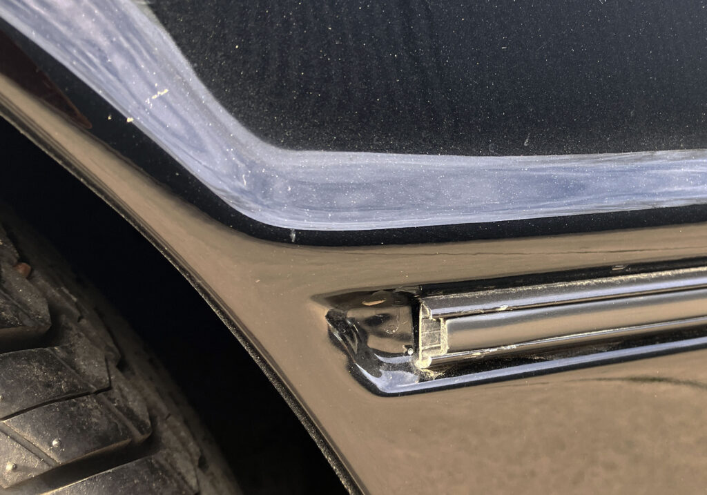
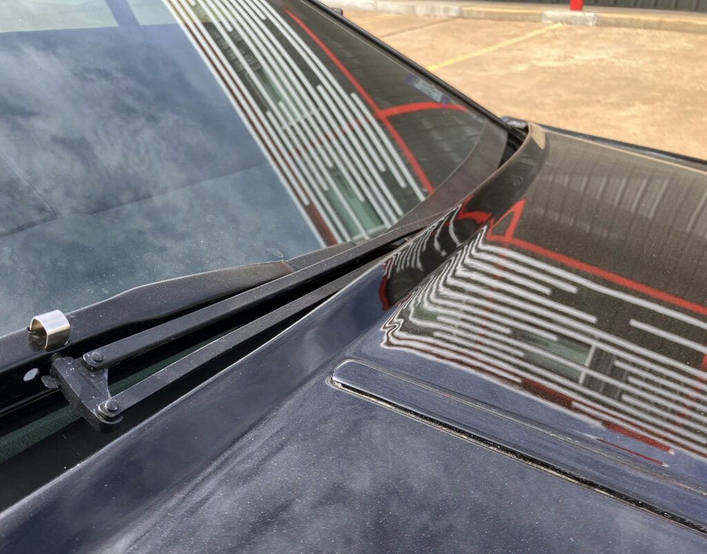
The small grille feeds into a bonnet bulge that spreads across a large area. From low down, the raised shape can seem almost flat; from above, it fans outward. The pop-up headlamp covers echo the straight edges of the fascia and fenders, while their angled shape follows the bonnet’s rise. That shifting visual effect is a key part of the Lagonda’s appeal: the body doesn’t reveal all its geometry from a single standing view.
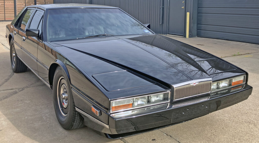
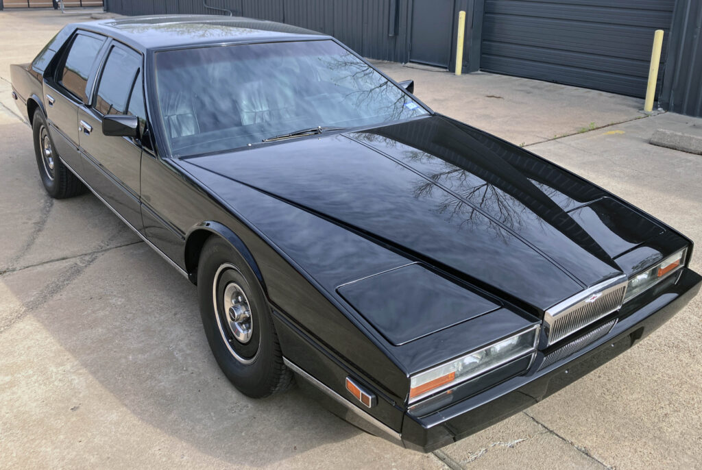
Proportion is the foundation for those surfaces. The long dash-to-axle distance and large front overhang make room for a bonnet that feels extravagant, while its steep downward line keeps the nose close to the road. Without that sweep, the blade fenders could look static, like those on a 1961–69 Continental. Instead, they read as part of a forward-driving wedge.
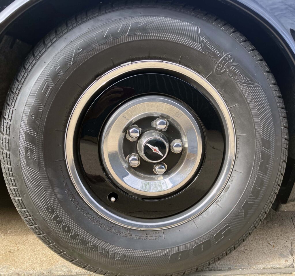
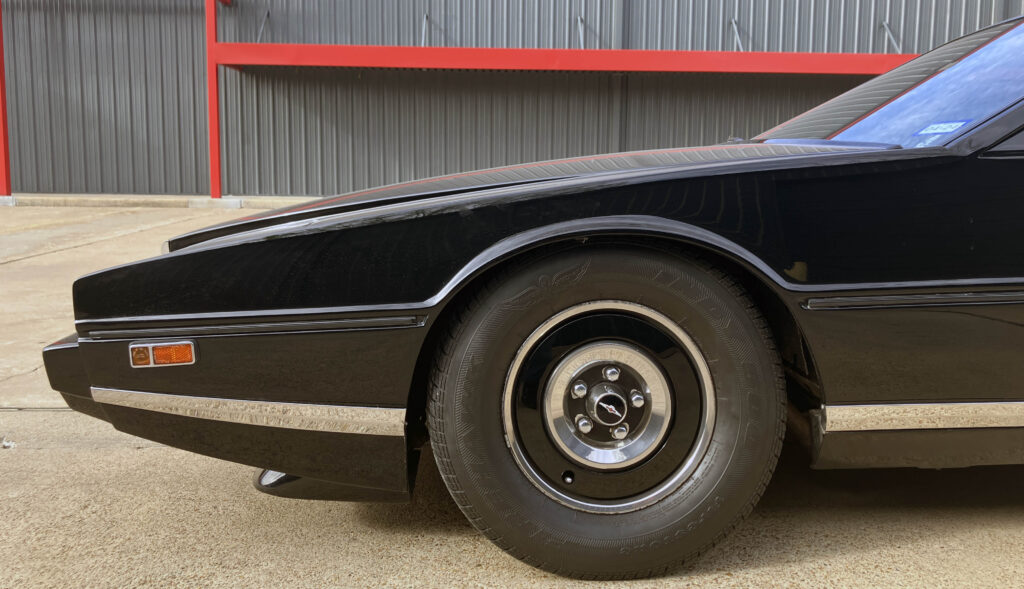
From the side, the body has more curvature than the wedge description suggests. The wheel arches wrap closely around the tyres, and the fender tops slope down toward them. The bonnet and wheel openings are shaped rather than folded into simple planes. A small cowl keeps the transition to the windscreen spare, while the hard bonnet edge gives the wipers a neat visual boundary. There’s a restoration consequence here too: custom mouldings that don’t come in one simple piece can be difficult to reproduce.
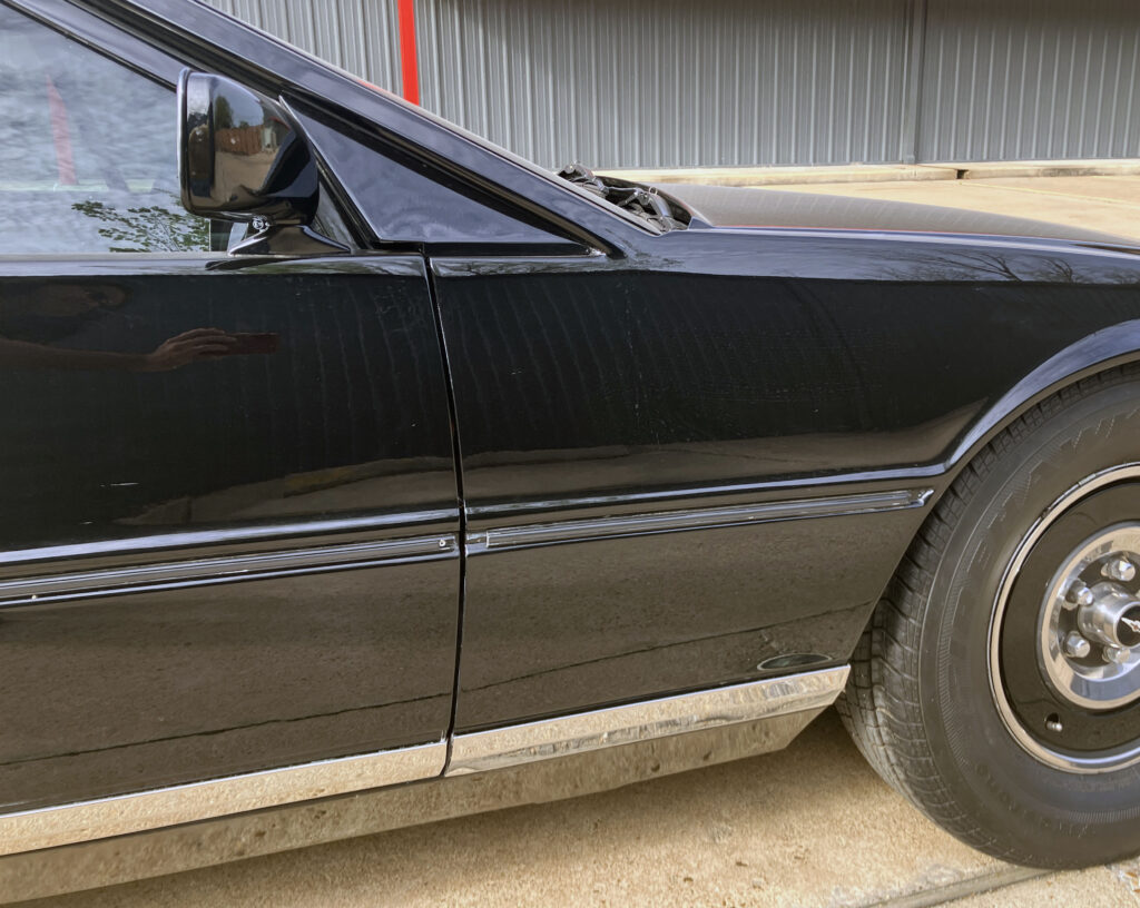
The colour-matched wheels introduce an unexpected note. Against the futuristic body, they evoke expensive cars from the 1930s. Later Lagondas often wore alloy wheels in silver, a more conventional choice that sits less comfortably with the car’s layered character. The original wheel treatment helps make the design feel like a luxury object rather than a styling exercise.
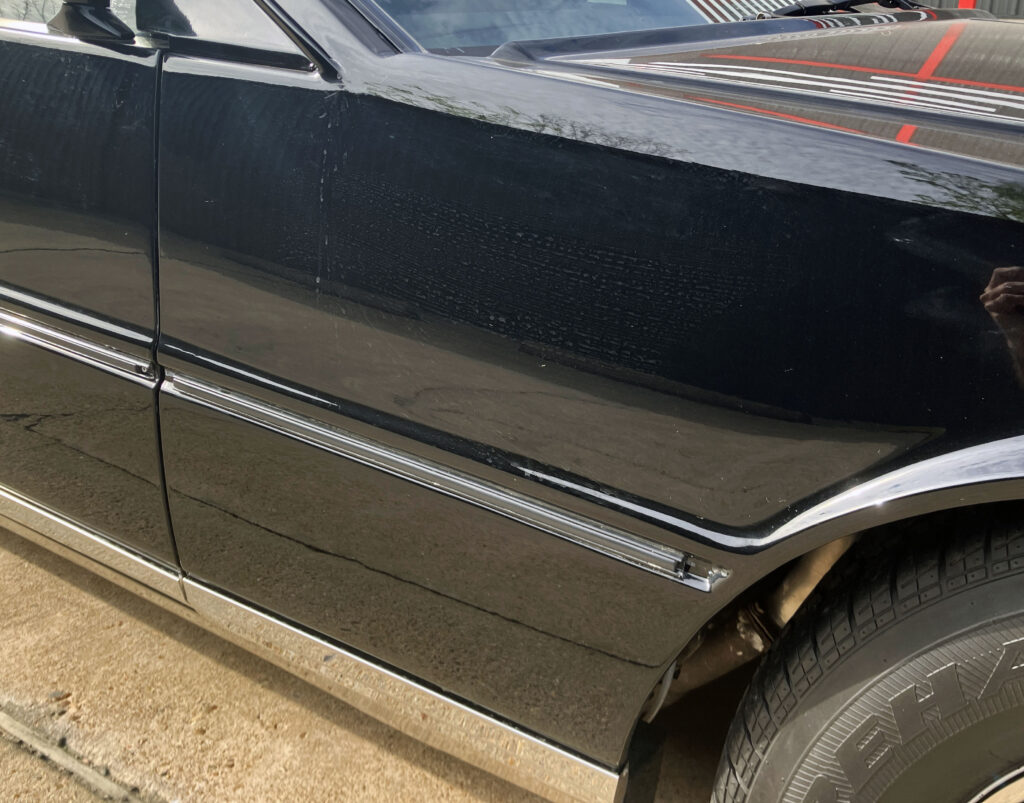
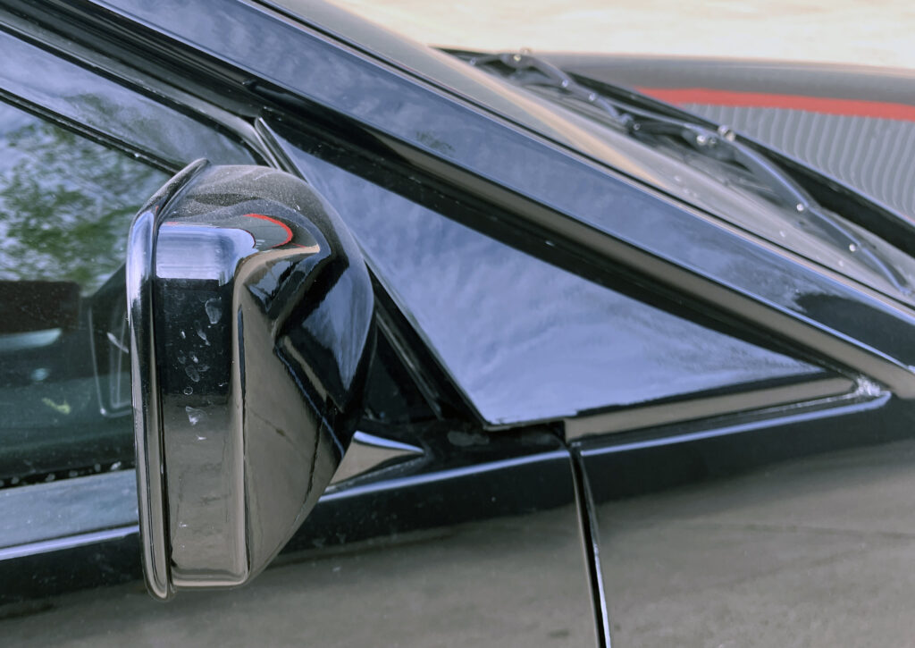
The cabin’s placement explains why the bonnet seems so vast. The windscreen sits well back, beneath a sharply raked A-pillar, and the hood remains exceptionally long even after allowing for that distance. Door glass and the nearly flat windscreen form a triangular greenhouse that gives the saloon a Countach-like silhouette. It’s a dramatic shape, though the rear doors and roof still have to work as parts of a four-door luxury car.
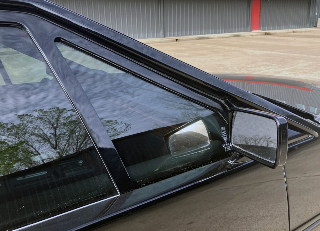
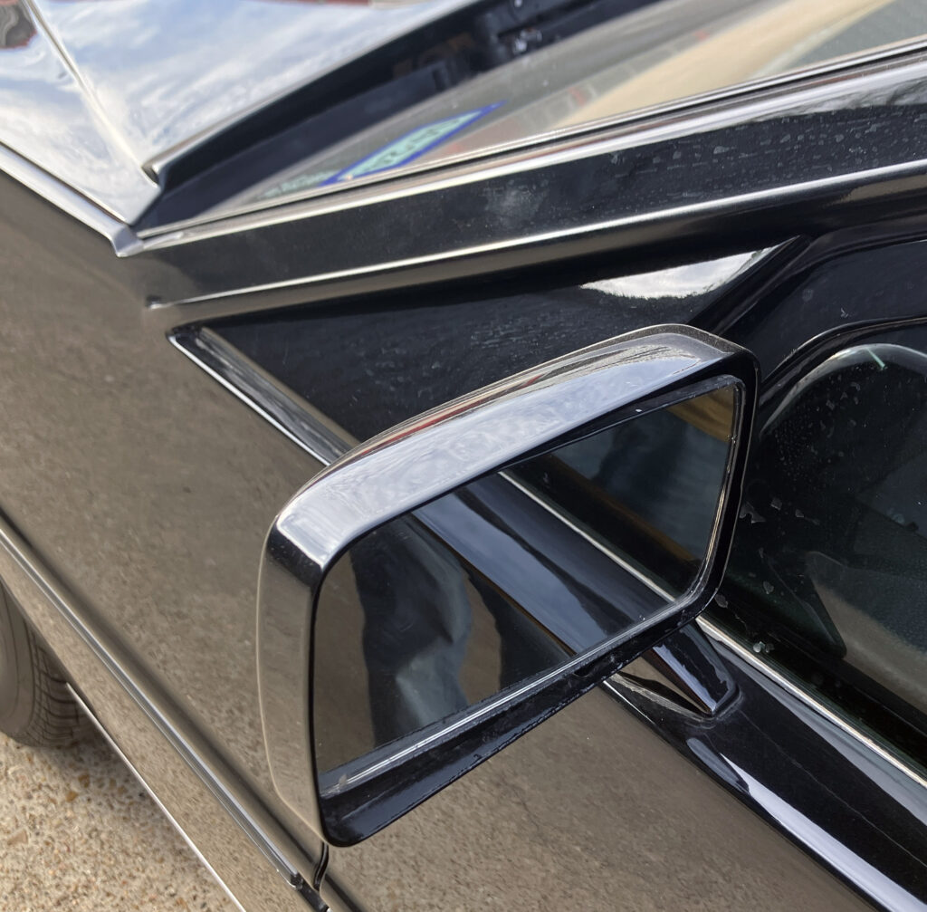
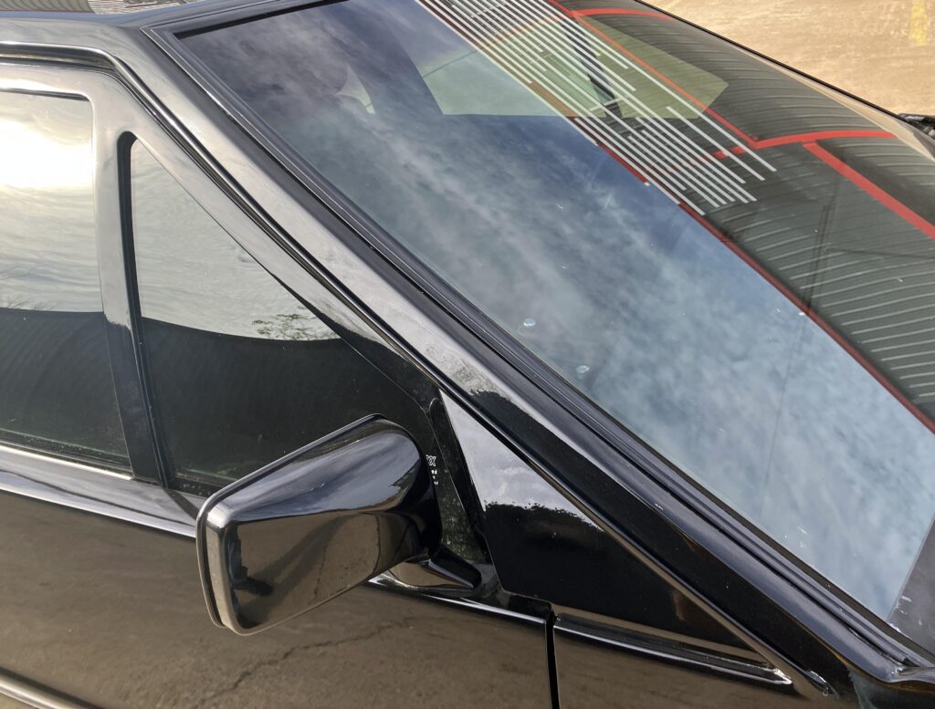
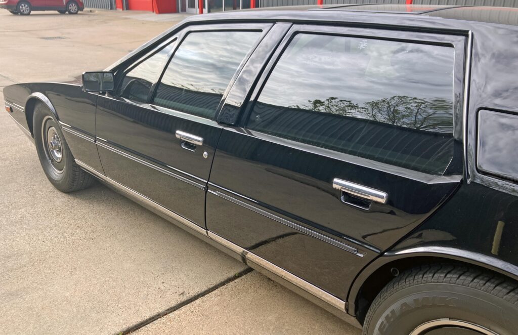
There’s an awkward black plastic triangle ahead of the door that could have been better integrated with the side mirror. The nearly flat windscreen contrasts with side glass that curves inward toward the roof, a feature known as tumblehome. Negative space between the glass and the lower body helps bridge those differing shapes without adding heavy trim.
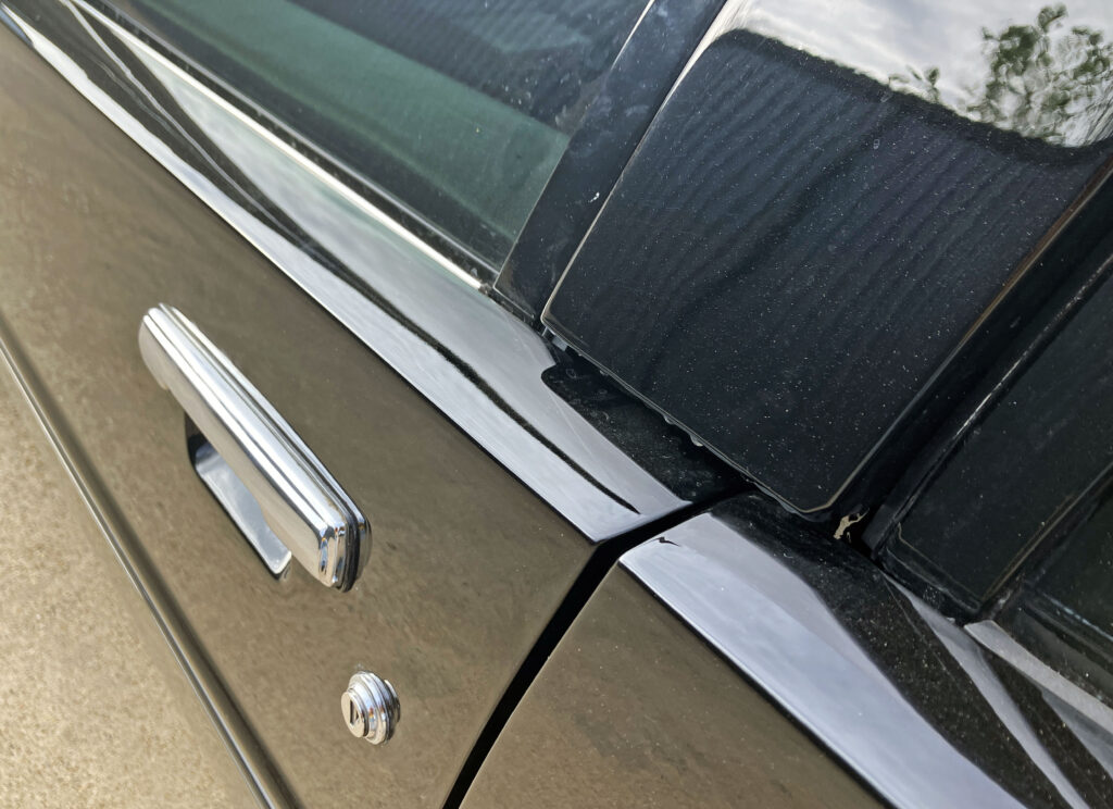
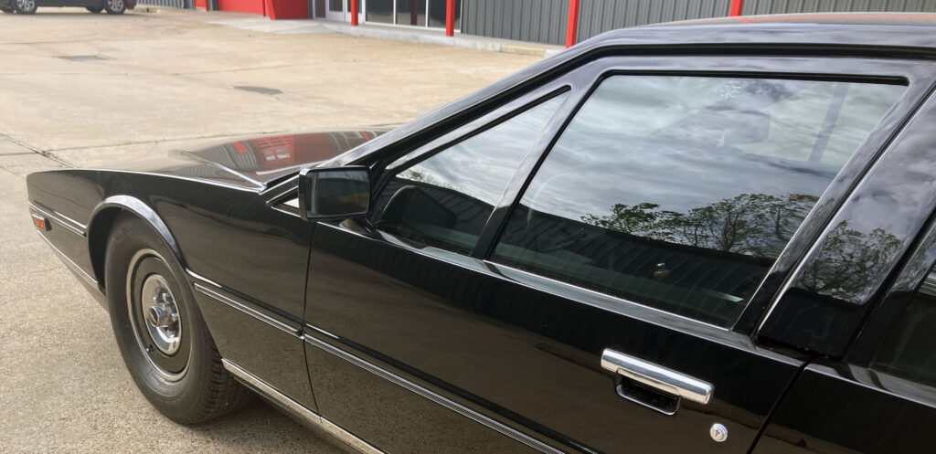
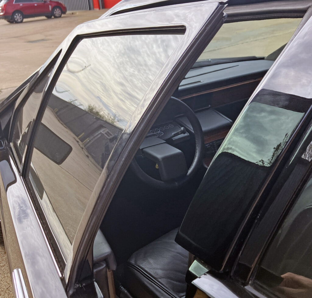
The rear door’s shape is a reminder that this is a three-box saloon, not a two-seat sports car. The B-pillar is straightforward, and the roof remains upright enough to serve rear passengers. Even so, the back door narrows as it meets the wheel arch, so getting in and out may not feel as effortless as it would in a more upright Rolls-Royce. The car’s low stance and sharp window line ask something of occupants in exchange for the spectacle.
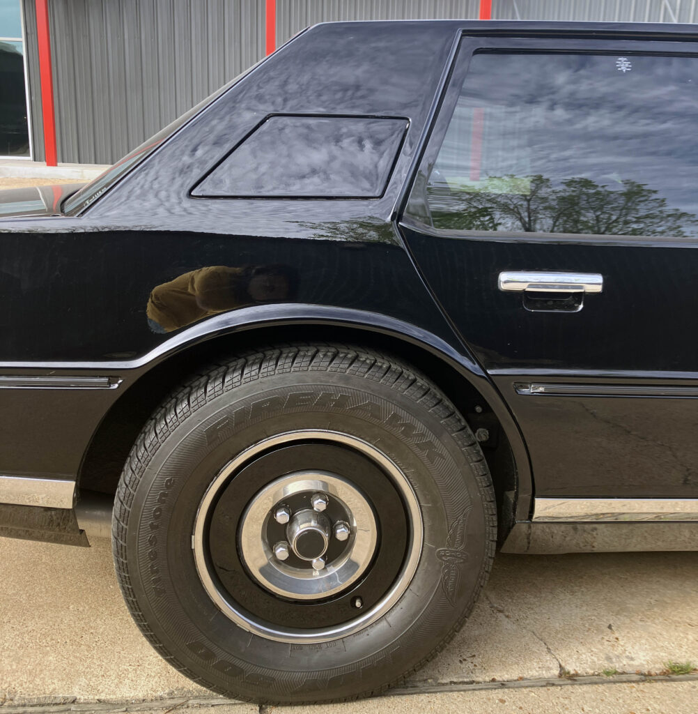
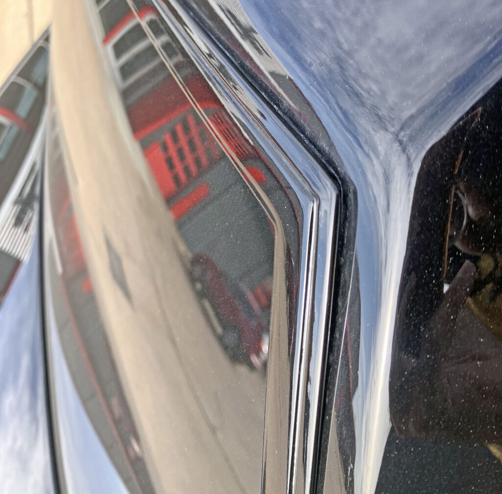
The roofline and hard-edged doors give the Lagonda its luxury-car presence without relying on a badge to make the point. Fuel-system doors are set into the rear flanks. At the rear window, an upward kink in the door frame meets the quarter panel with a firm angle rather than a rounded flourish. On Series I and II cars, the rear side windows are fixed, giving them a visual resemblance to a 1978 Chevrolet Malibu sedan, though their overall proportions are anything but ordinary.
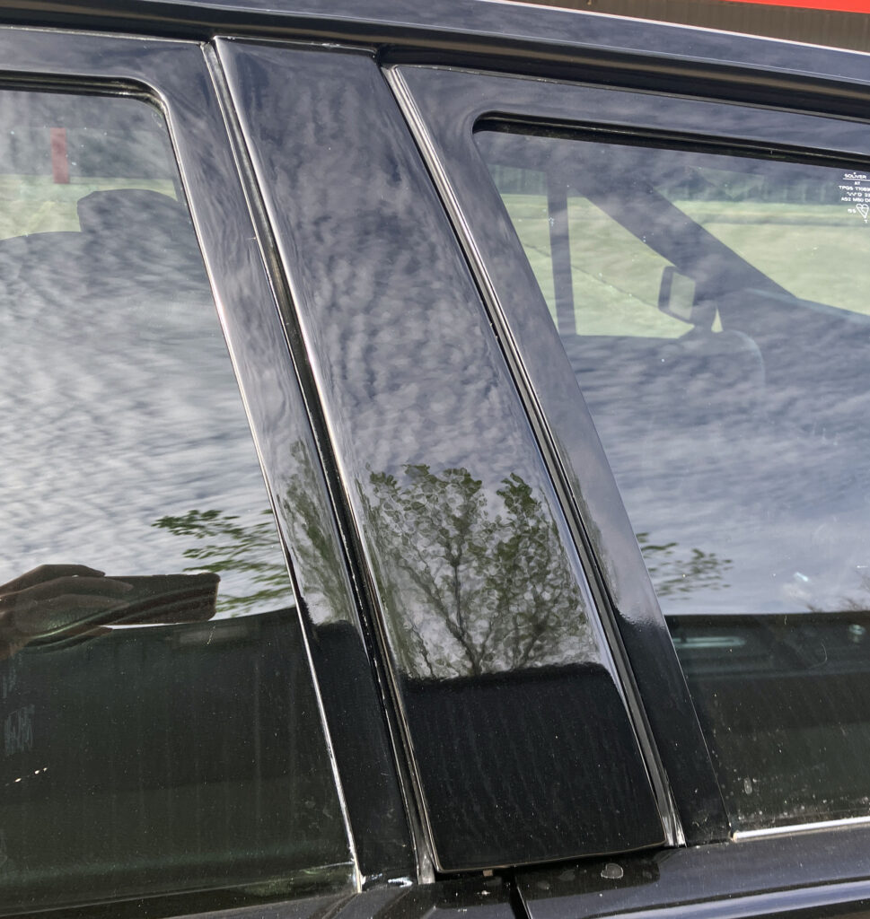
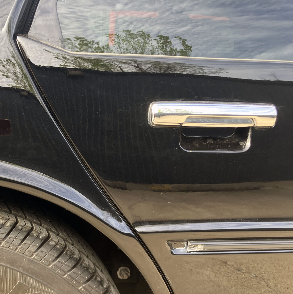
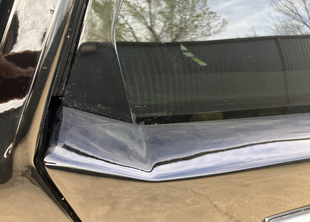
The Lagonda’s profile reshaped the idea of prestige around aerodynamics and a low centre of visual mass. Its cabin appears tightly packaged within the body, while the roof and window line sit low over the wheels. The visual trick is reinforced by deep contouring below the chrome side strip: the lower body seems to recede, leaving the eye to follow the glass and the long horizontal lines above the tyres.
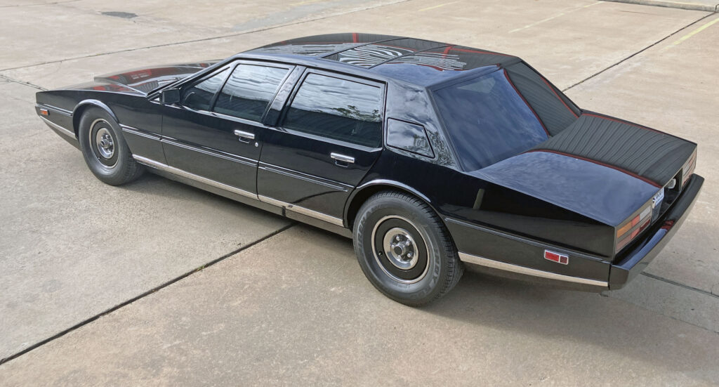
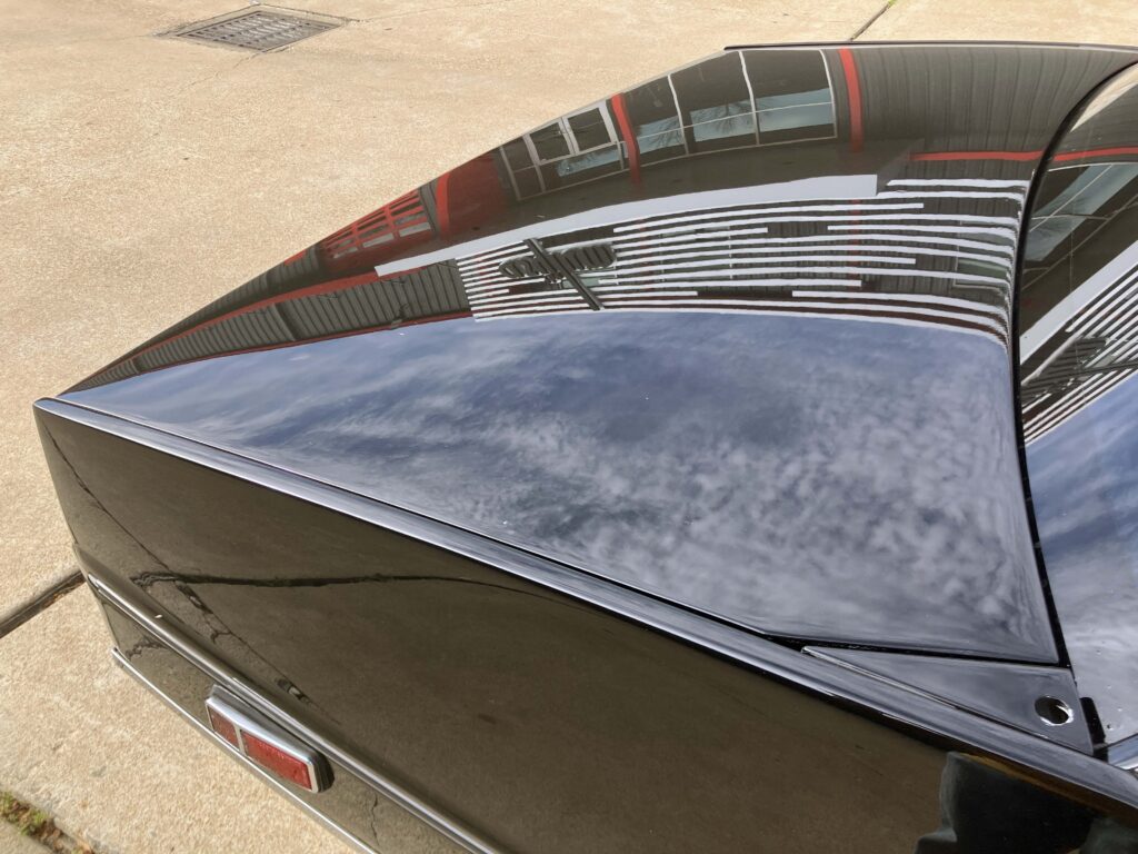
Its rear proportions also depart from the familiar long-bonnet, short-boot formula. The decklid is long and slopes gently downward, which gives the luggage compartment more usable volume than a low, flat tail might allow. That practical choice matters on a car whose design could easily have sacrificed everyday usefulness for a more dramatic profile.
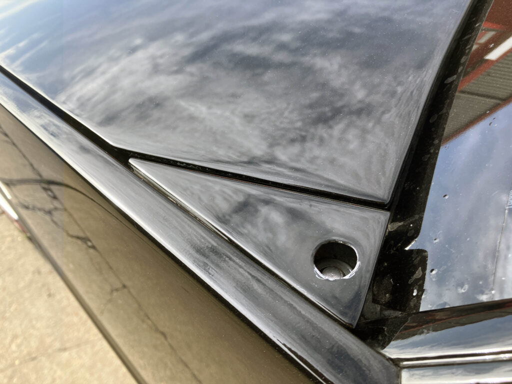
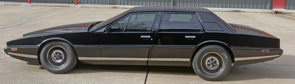
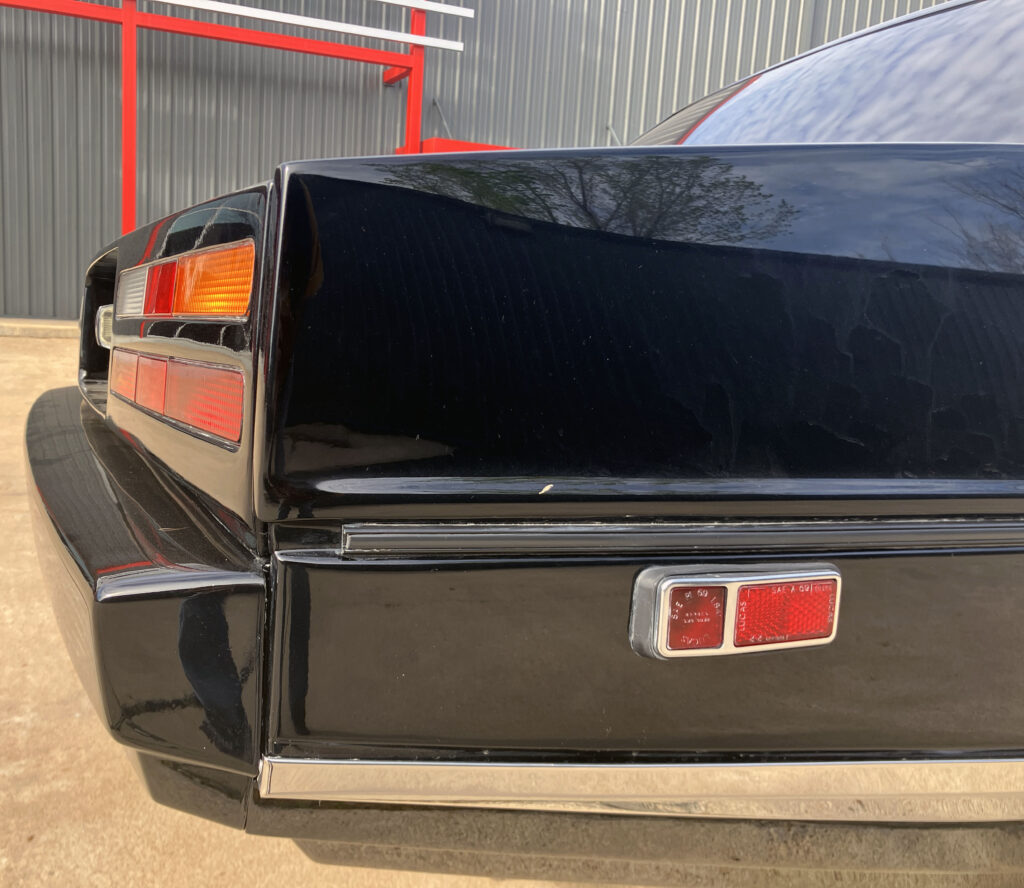
A raised metal section for the power antenna sits on the deck, a functional detail that doesn’t match the elegance of the bonnet. Still, its downward sweep follows the surrounding contours. The rear fender repeats the front’s long lines and descending shape, though its marker lamp looks just as clumsy. A crease in the chrome trim and the stepped lower quarter add definition where a broad, flat panel might otherwise look blank.
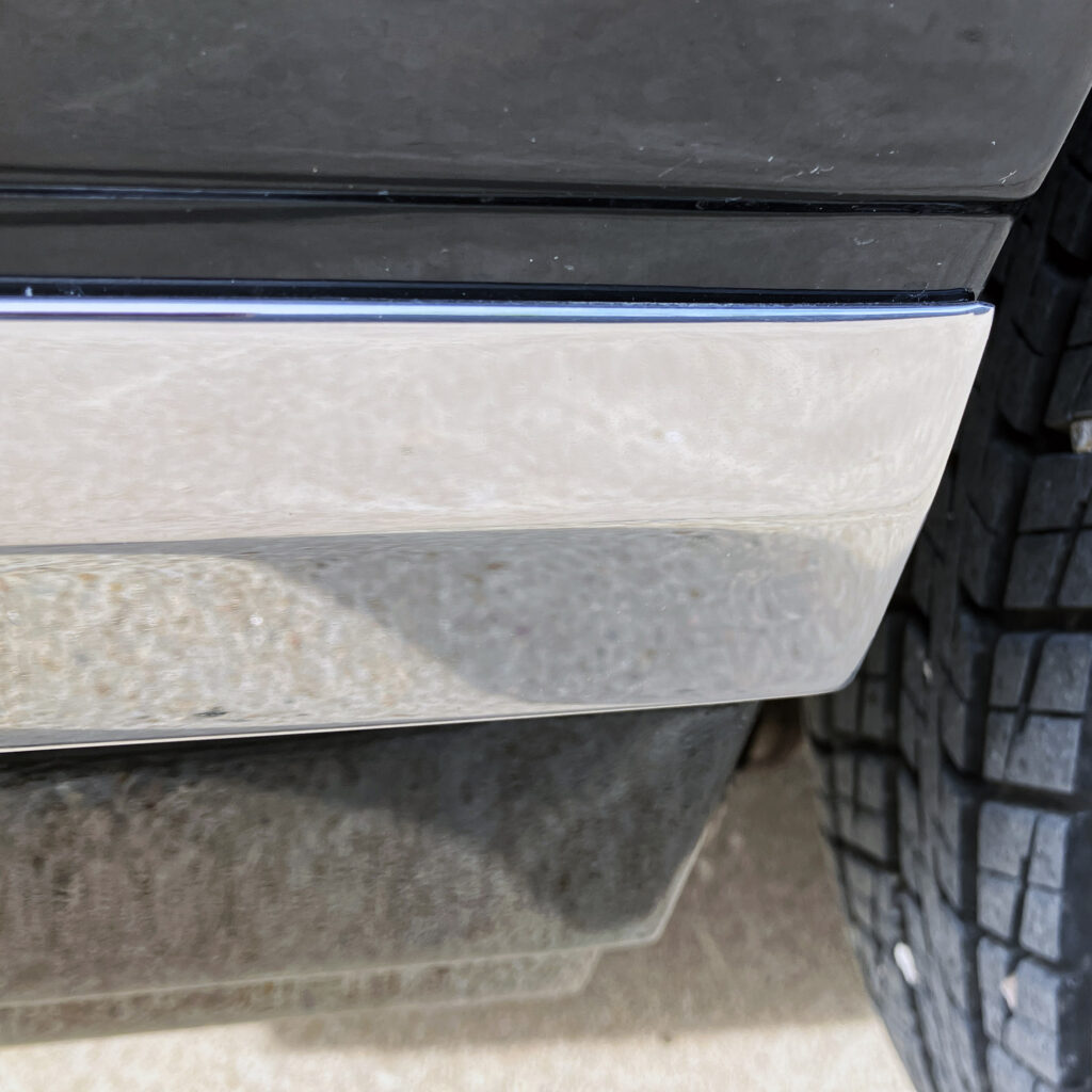
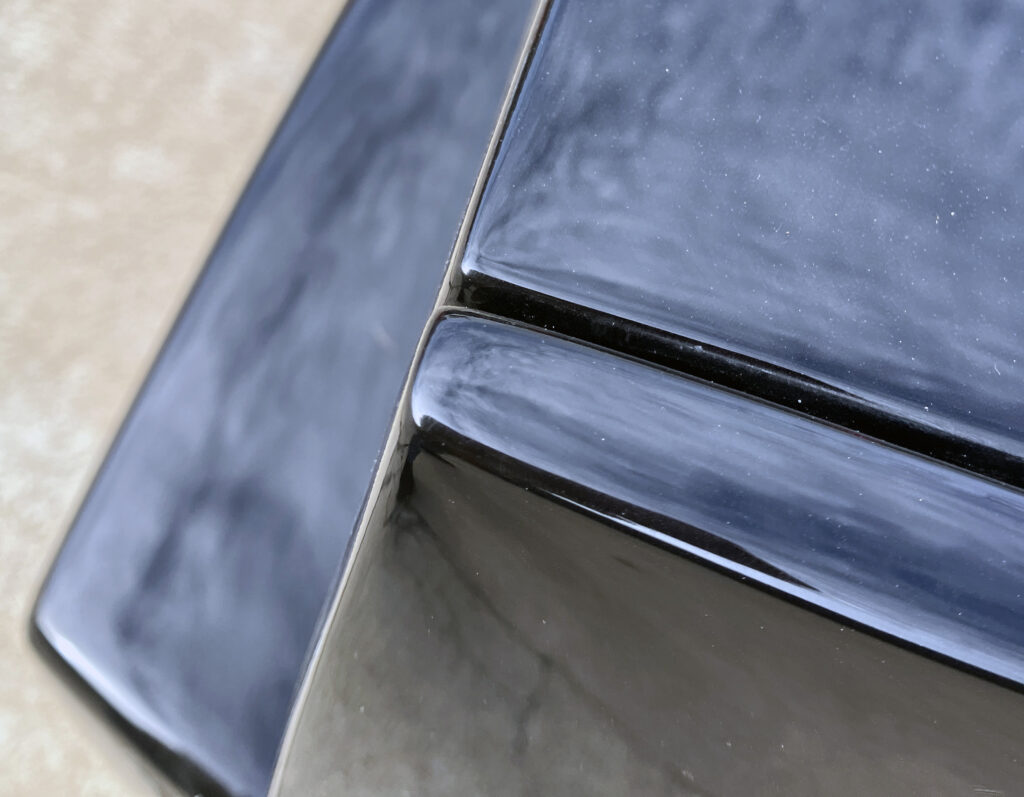
From some viewpoints, the rear quarter seems out of line with the decklid. The apparent mismatch comes from the deck’s considerable extension and its steeper drop toward the ground, which differs from the quarter panel’s angle. The narrow top and bottom edges of the lid keep the rear looking delicate. Recessing the number plate also draws attention away from the bulky lamp assemblies around it.
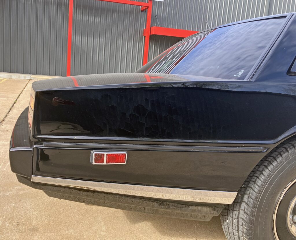
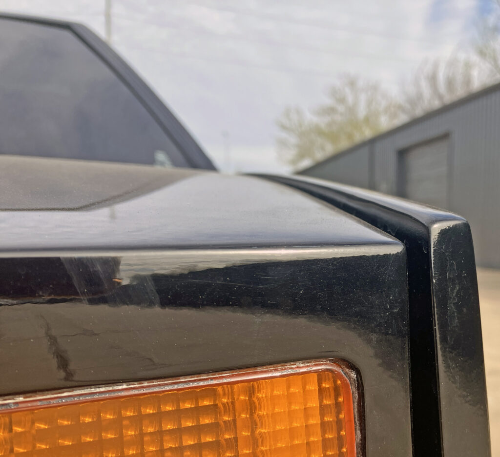
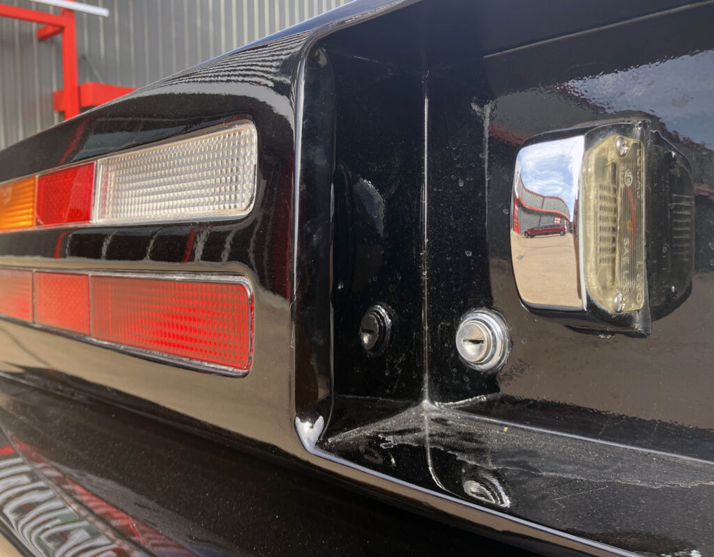
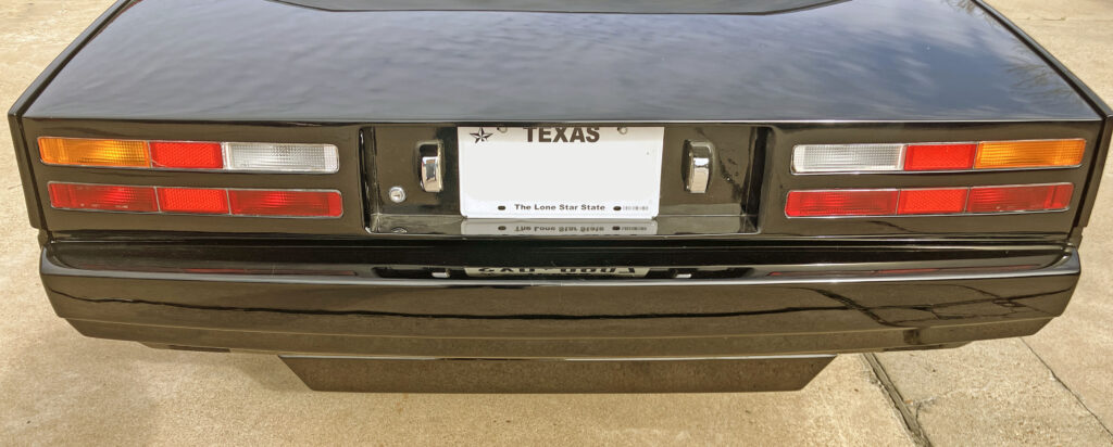
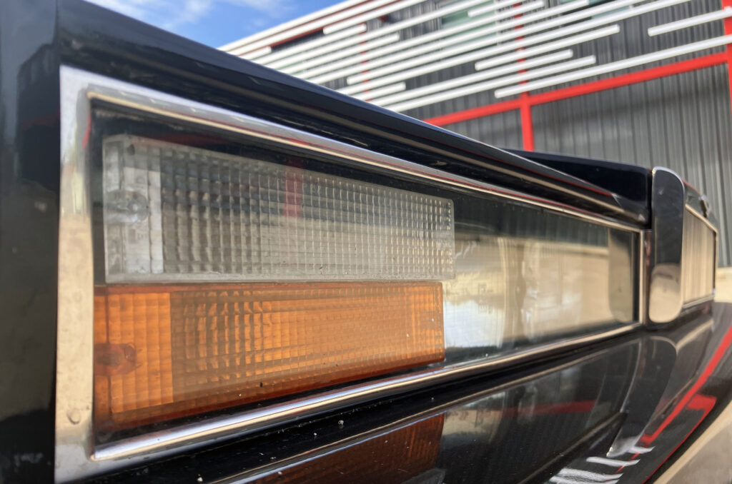
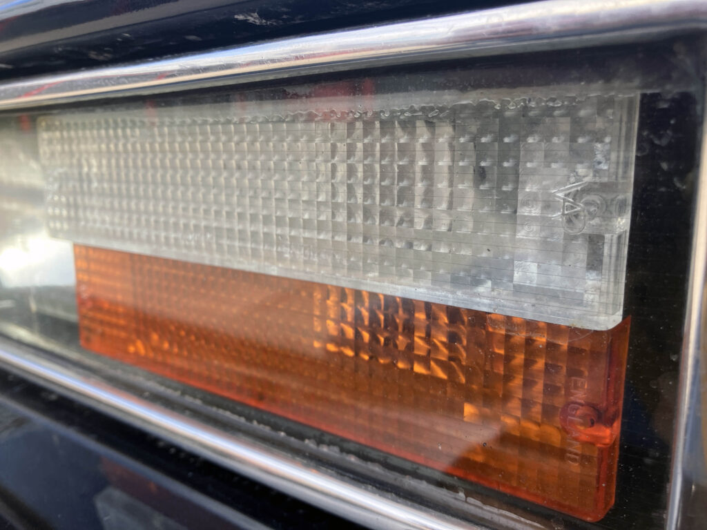
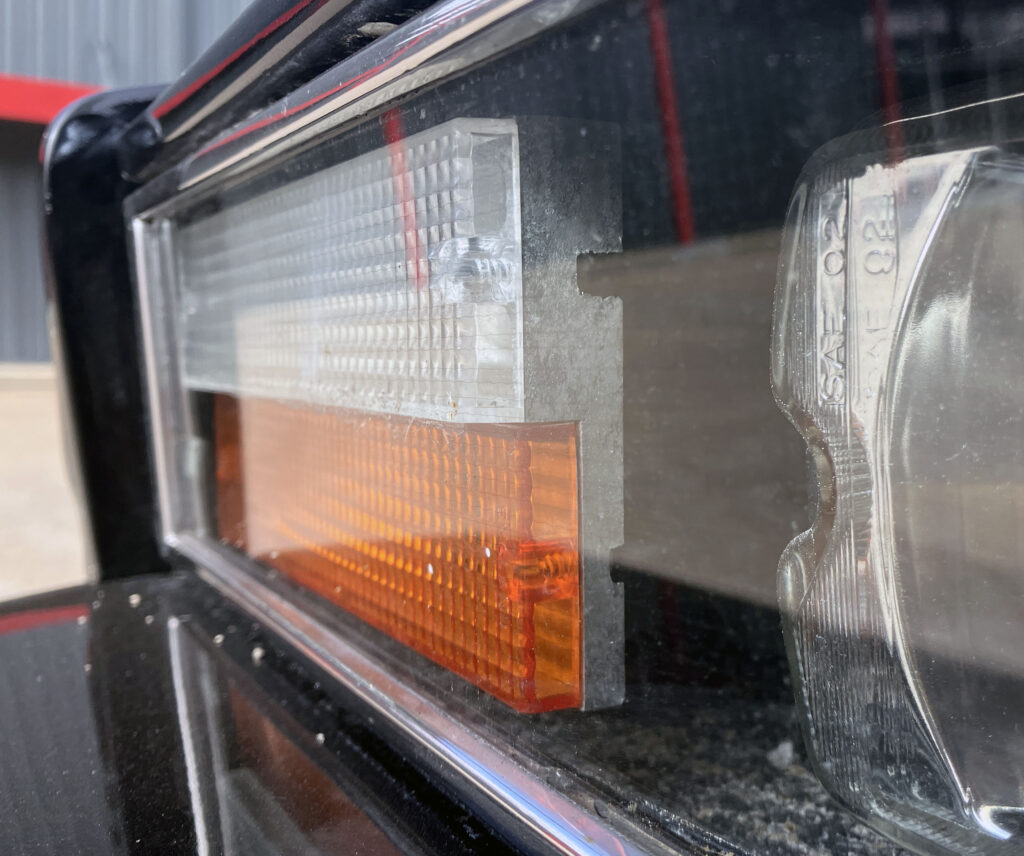
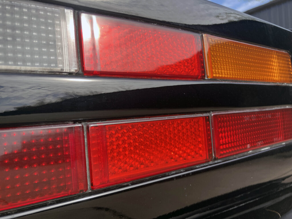
At the tail, the individual rectangular elements in the lamps have a pixel-like look that feels at home beside the Lagonda’s electronic dashboard. Each part of the lens has a distinct job, from turn signal to brake light and reflector. It’s an early piece of visual technology that gives the car a surprising connection to later designs with geometric lighting, including the Hyundai Ioniq 5.
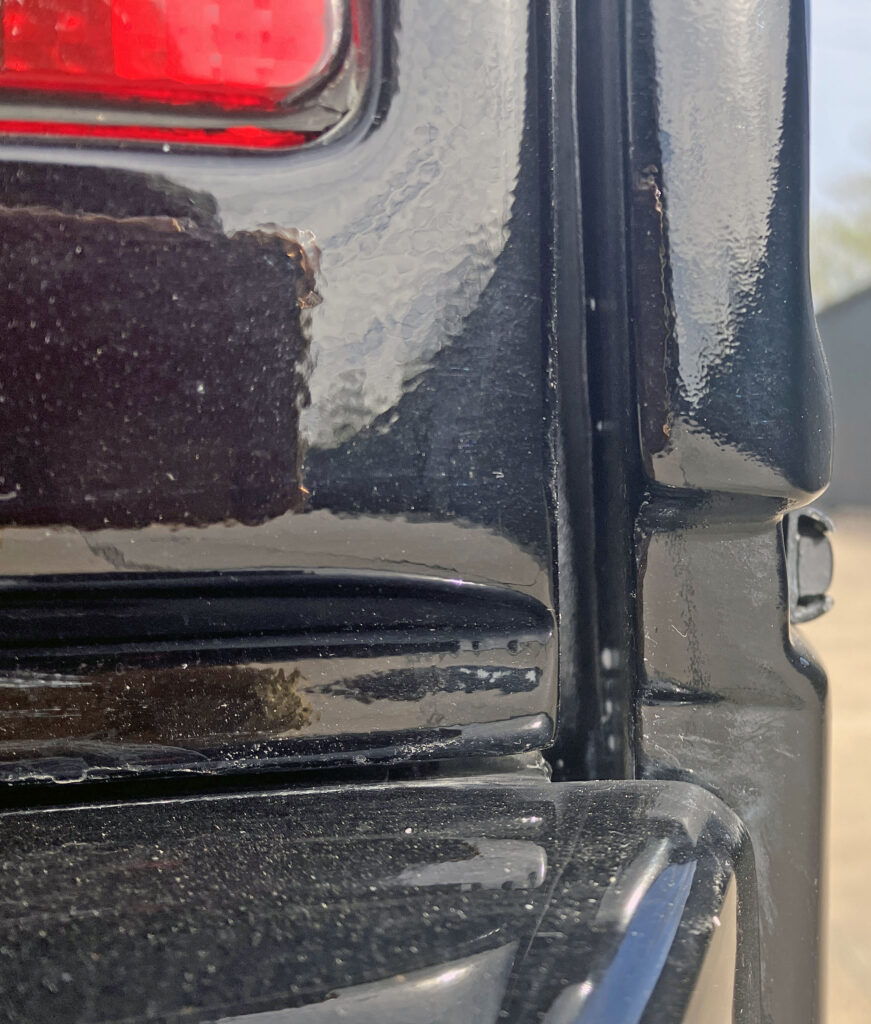
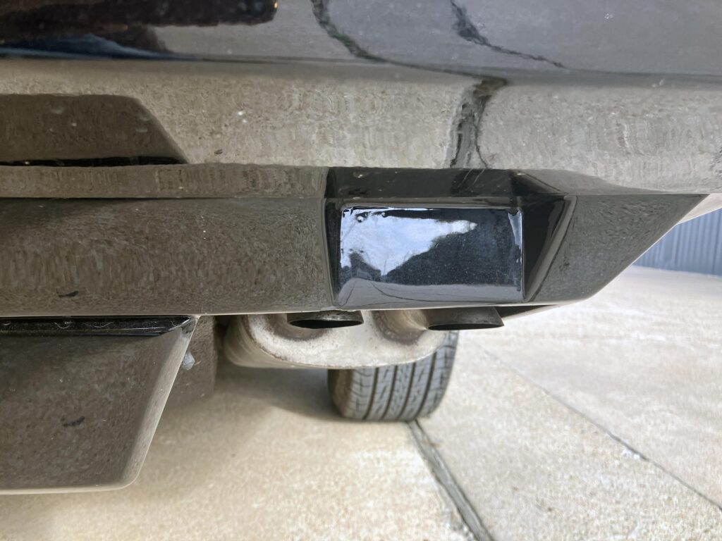
The rear bumper is another imperfect fit with the rest of the body. The stepped lower quarter continues into it, making the lower section seem thinner and helping the upper body look lighter. A small central bump covers a functional body element; it interrupts the clean tail, but may have been needed to preserve the smooth outline from other angles.
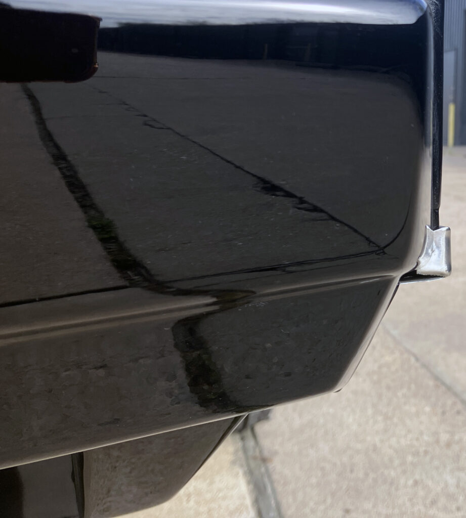
There’s an exhaust outlet at each corner. The space where European cars have rear fog lamps is blank on this example, and the narrow openings don’t accommodate the twin-tipped mufflers. A little extra chrome might have suited a high-priced performance saloon, but the restrained finish is consistent with the car’s preference for geometry over decoration.
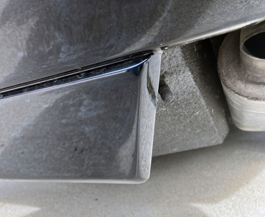
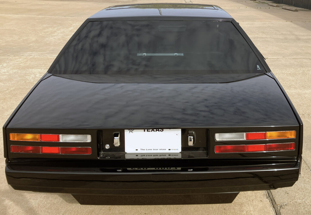
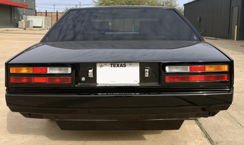
Seen from the rear, the Lagonda can seem almost like a spacecraft: a long, clean body with its details pressed into the surface rather than added as decoration. The effect makes the car an unusually complete expression of 1970s minimalism. It isn’t flawless. The bumpers and marker lights reveal the compromises of building a complex design with the technology and resources available at the time. But those rough edges make the ambition easier to appreciate, not harder.
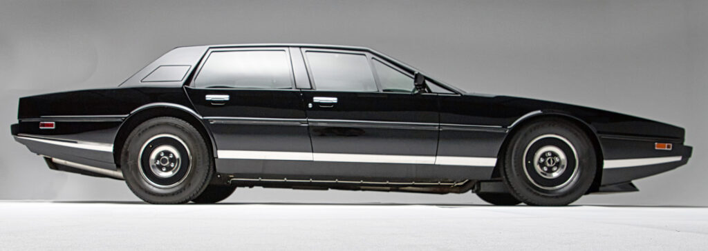
There’s a strong link between the Lagonda’s geometric body and modern abstract art, but the car’s achievement is practical as well as visual. Towns and his team brought the wedge into production in a form with four doors, a functional cabin and a useful boot. That combination separates the Lagonda from the Countach, its closest styling cousin: both look daring, but only one was drawn as an everyday luxury saloon.
Production remained limited for reasons the source describes as regrettable, and the car was unsuccessful by most measures. It still carried a serious performance pedigree beneath the unusual bodywork. Those facts don’t cancel each other out. The Lagonda could fail commercially while succeeding as an example of a manufacturer willing to put an uncompromising design into showrooms.
That willingness is the car’s lasting point. Aston Martin built a low, angular flagship with a long bonnet, a technology-forward dashboard and the proportions of a much less practical exotic. It asks the viewer to accept a few awkward details in return for a shape that still has no obvious peer among luxury saloons. For enthusiasts, the Lagonda remains proof that the occasional design gamble can leave a stronger mark than a safer success.