In lane Electric Vehicles
Citroën SM Tribute Looks Heavy Beside the Original
Description
The SM Tribute gets the classic coupe’s dimensions close, but its stance and reliance on two-tone paint dilute the original’s finesse.
The Citroën SM Tribute has the right starting point: a low, tapered French coupe with a design history worth revisiting. Its proportions track the 1970s SM closely, and the concept has a few details that could work on future cars. But the comparison also exposes what’s missing. The new car looks heavier, and its visual identity depends too much on a two-tone finish.
My attachment to Citroën began early. My father chose a BX as our family car in 1985, and its unusual shape made an impression before I knew Marcello Gandini had designed it. Later, I saw a DS at the back of a local dealer’s used-car lot. I was eight, and the car seemed improbably futuristic for something already old enough to be unwanted by most people there.
That childhood encounter left me looking for low, teardrop-shaped French cars. So Stellantis’ SM Tribute concept ought to be an easy favorite. It makes a strong visual statement and includes some thoughtful details. Yet when it appears beside the classic SM, the newer design loses much of the older car’s lightness and poise.
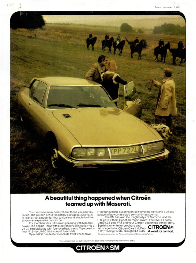
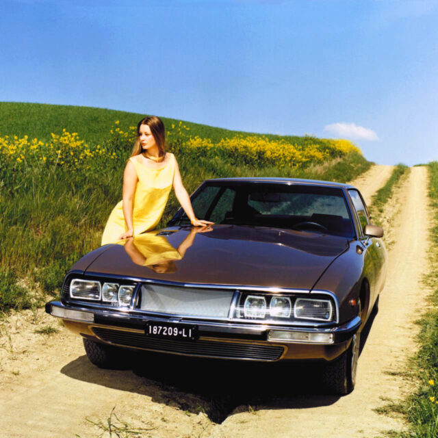
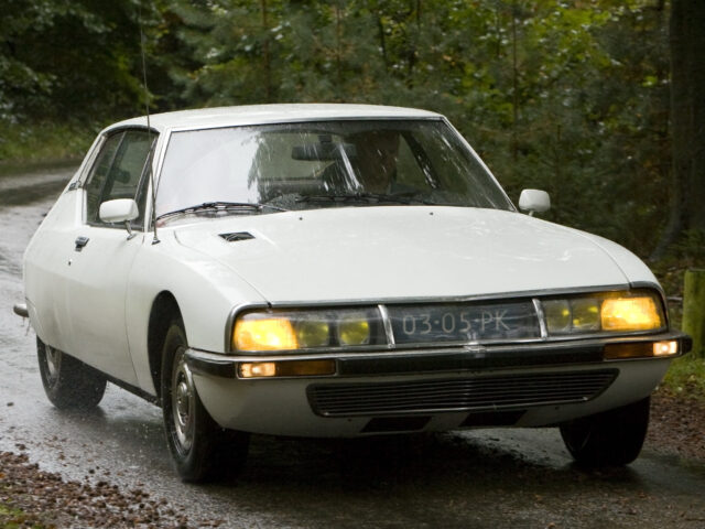
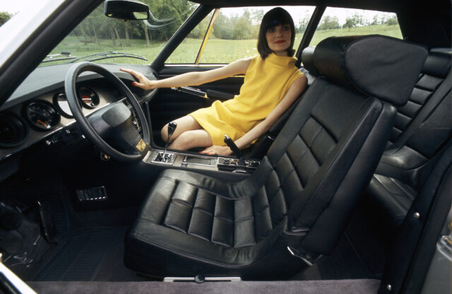
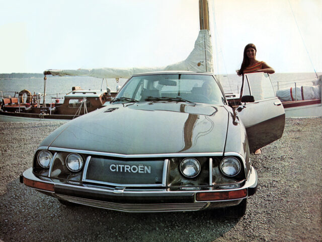
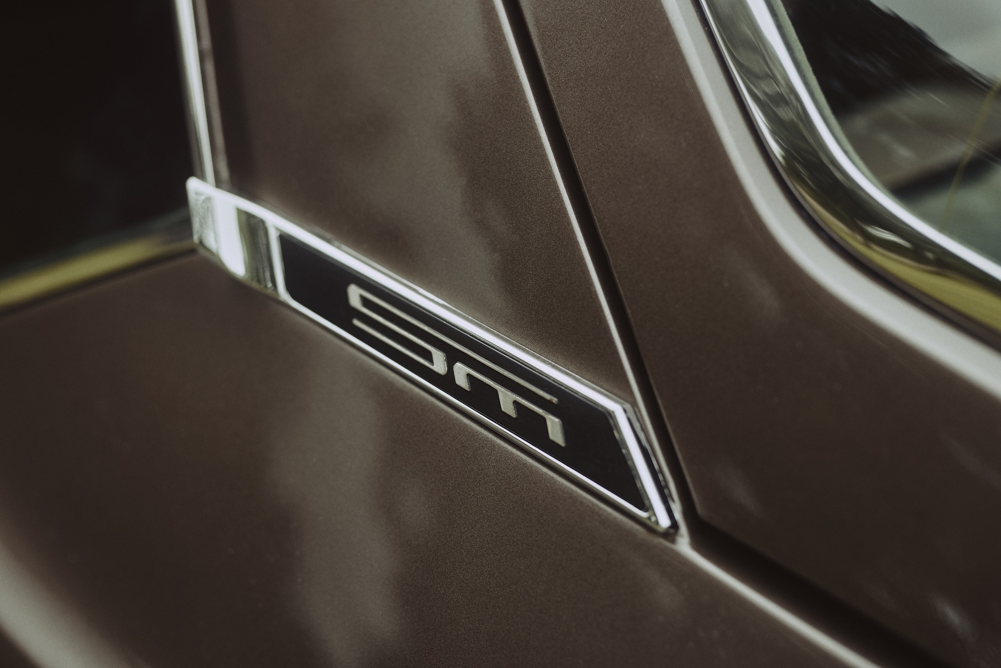
That gap matters because the Tribute is a static display concept. It doesn’t need to accommodate a production platform, and the usual explanation of compromises for current safety requirements doesn’t apply. The design team had room to make a direct visual interpretation of the original, so the comparison invites close scrutiny.
Similar dimensions, different stance
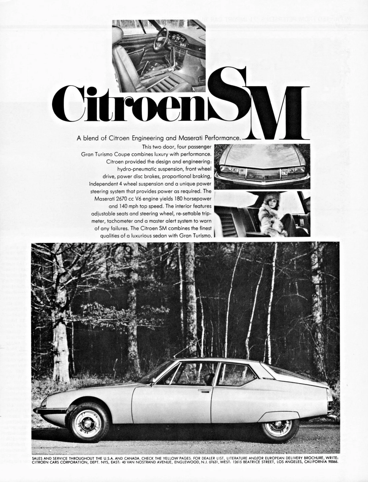
On paper, the Tribute stays remarkably close to Robert Opron’s SM. It is 1.2 inches longer and 0.7 inches taller. The front and rear overhangs look similarly balanced, and the cabin remains set toward the rear, even though the steeper windshield angle extends its volume forward.
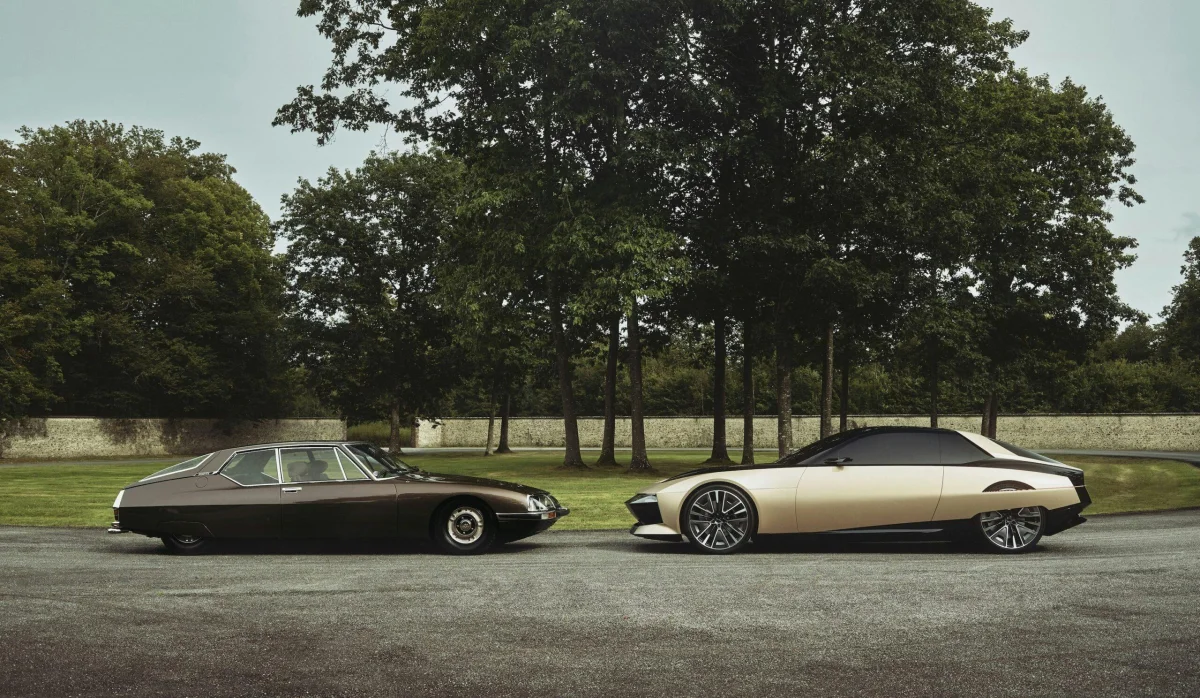
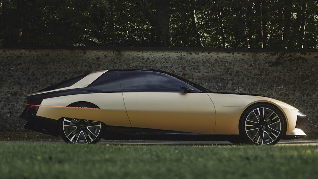
Similar dimensions haven’t produced a similar sense of movement. The Tribute’s 22-inch wheels and broad arches give it a square, planted stance. The classic SM’s narrowing rear body and concealed rear wheels create a different effect: the car seems to taper away, disguising the length of its side surfaces when viewed from the front quarter.
That taper served an aerodynamic purpose, as did the narrower rear track. It also shaped the car’s appearance. Opron’s design looks simple at first glance, but its surfaces and proportions quietly guide the eye toward the back. Covering the rear wheels helps keep that outline uninterrupted.
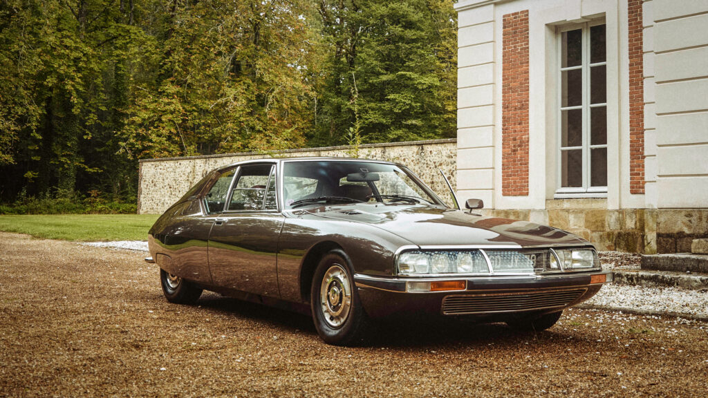
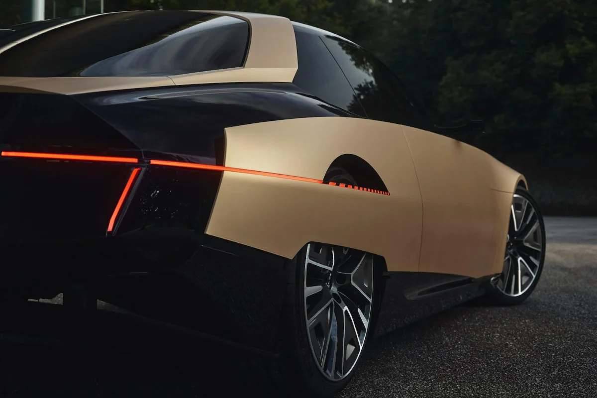
The Tribute takes the familiar sports-coupe approach instead: large wheels, pronounced arches and a more upright visual presence. None of those choices is inherently wrong. Together, though, they make the car feel thick beside the older SM, especially when the rear wheels are partly hidden.
There’s a smart detail in the small opening cut into the rear fender, which reveals the upper part of the rear wheel and interrupts the covered-wheel shape. It may divide opinion, but it gives the rear quarter a distinctive graphic feature. That treatment relates neatly to the slim, sharp lighting at the back.
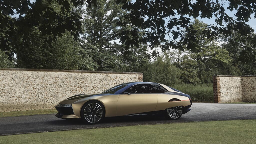
The sides are where the Tribute’s bulk becomes harder to disguise. The original SM uses two long body lines to break up its broad surfaces and create changing bands of light and shadow. The Tribute’s cleaner, unbroken sides make those surfaces appear taller and fuller. That contributes to the heavier impression even though the overall proportions remain close.
A design that depends on its finish
The concept also separates a glossy black central section from matte gold bodywork that wraps around it like an outer shell. That layered treatment recalls the visual approach used on BMW’s 2009 Efficient Dynamics concept, which previewed the i8 hybrid supercar. Here, the contrast carries much of the Tribute’s design idea. In a single color, its central visual effect would largely disappear.
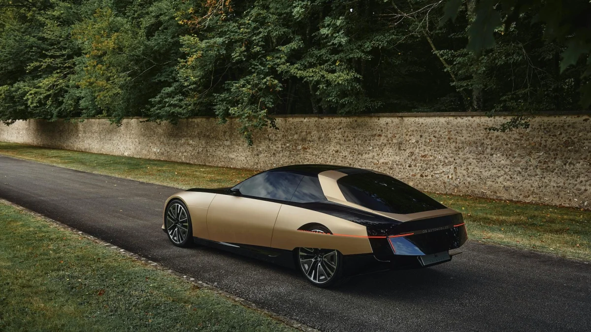
A concept should be able to hold together across different finishes. Battista “Pinin” Farina reportedly had prototypes painted a plain, medium gray for that reason: a design’s shape should remain convincing without color doing all the work. The Tribute’s front end comes closest. Its light bar is an especially appealing feature, though the two-tone treatment still helps that area make its strongest impression.
The SM Tribute isn’t a failure, and it isn’t a modern SM brought back to life. It’s an uneven exercise in nostalgia, with a few details worth keeping and a whole-car form that doesn’t match the original’s finesse. The 1970s car expressed a confident, distinct view of what an automobile could be. The more interesting question for Citroën is how to recover that design conviction in a future car of its own.
Matteo Licata earned a degree in Transportation Design from Turin’s IED (Istituto Europeo di Design) in 2006. He worked as an automobile designer for about a decade, including at the Fiat Group’s Turin design studio, where his interior proposal for the 2010–20 Alfa Romeo Giulietta was selected for production. He later joined Changan’s European design studio in Turin and EDAG in Barcelona. Licata teaches automobile design history to Transportation Design bachelor’s students at IAAD (Istituto di Arte Applicata e Design) in Turin.
The post Opinion: French Design Deserves Better than the Citroën SM Tribute appeared first on Hagerty Media.